BlogGuide
Infographic One‑Pager: 6 Examples, Scored on Words Against Charts
We sorted our template library by charts against text. 6 infographic one-pager examples, scored on words and visuals, and what the best share.

By MakeOnepagers Team
Updated · 11 min read
An infographic one-pager is a single page where charts, big numbers, icons and simple diagrams carry most of the message, and the words are there to label them. It suits any message built on numbers: an impact report, a budget, a case study result or a policy brief. A reader gets the point in the time it takes to look at it, then reads the labels if they want more.
One‑Pager examples
Real One-Pagers made with MakeOnepagers. Open any one to edit it as your own.
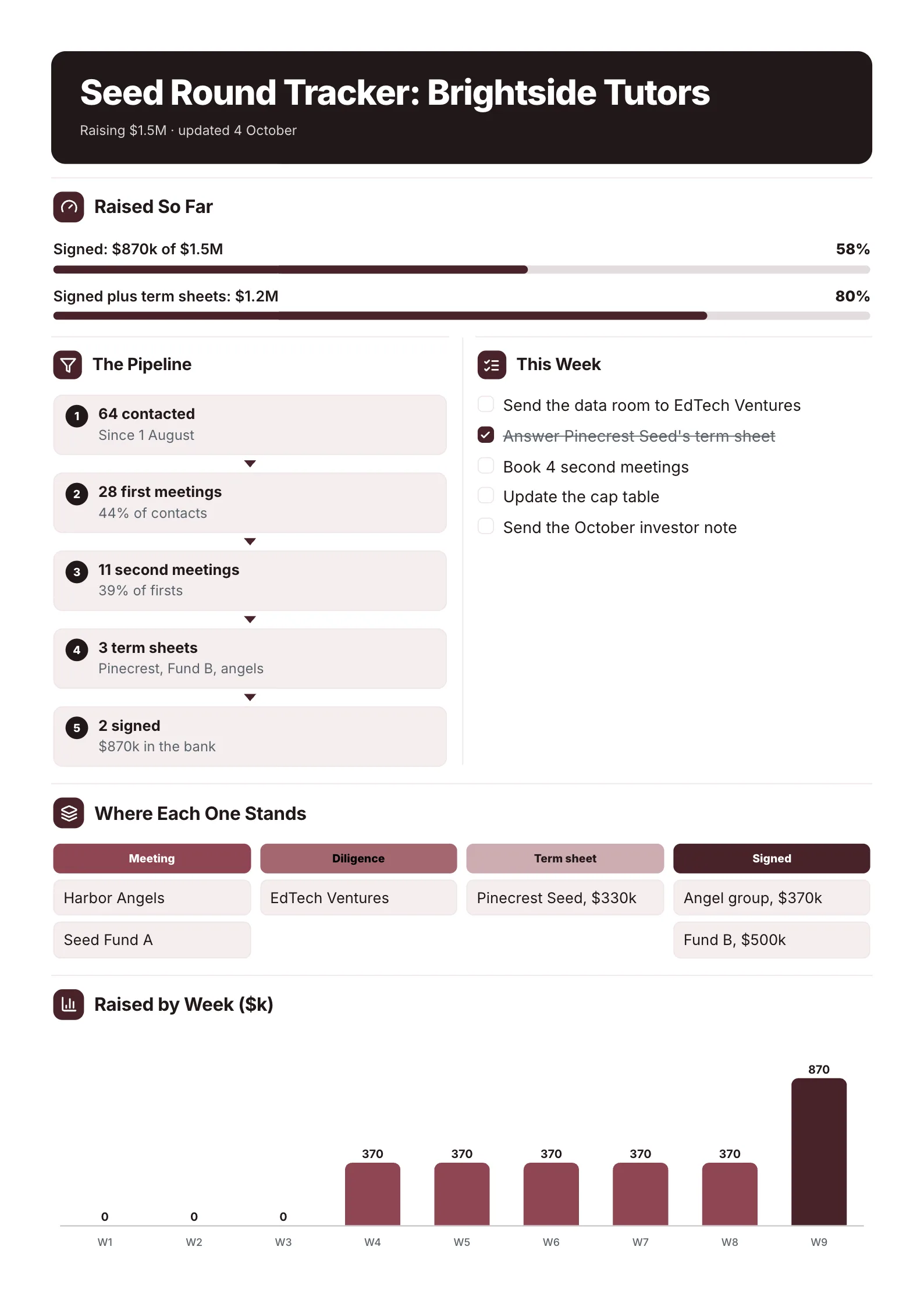 Fundraising TrackerEdit for free(opens in a new tab)
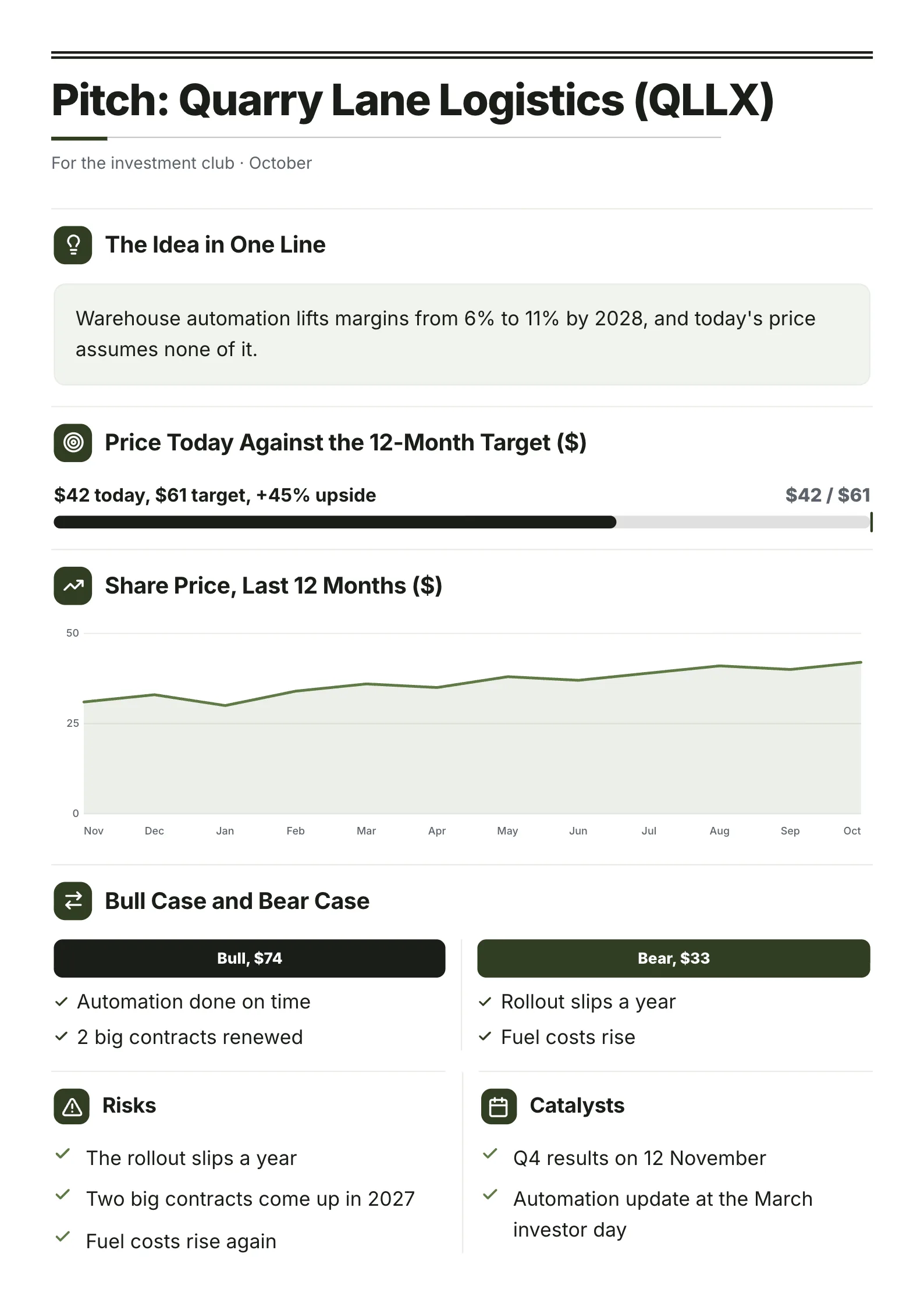 Stock PitchEdit for free(opens in a new tab)
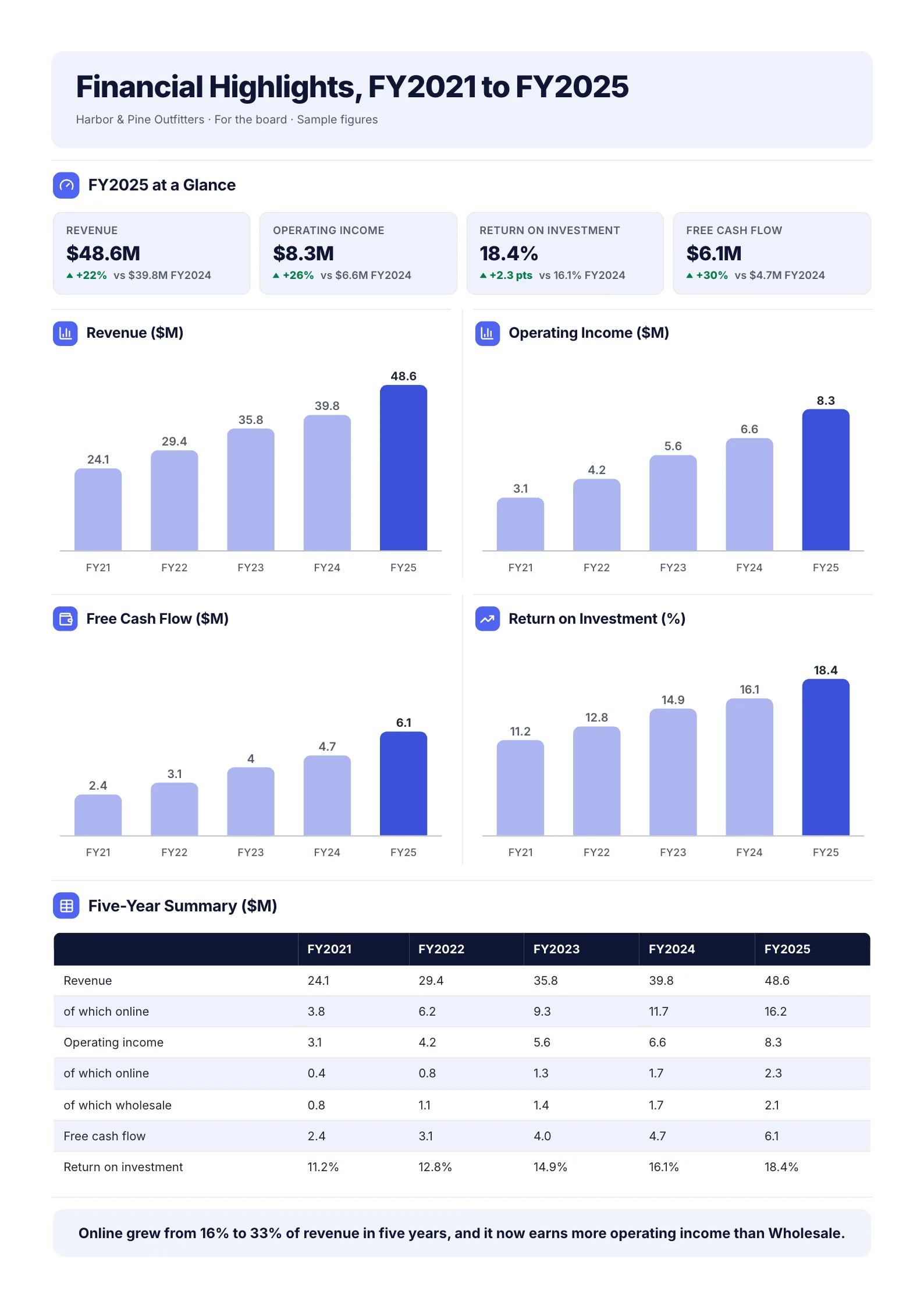 Five-Year Financial HighlightsEdit for free(opens in a new tab)
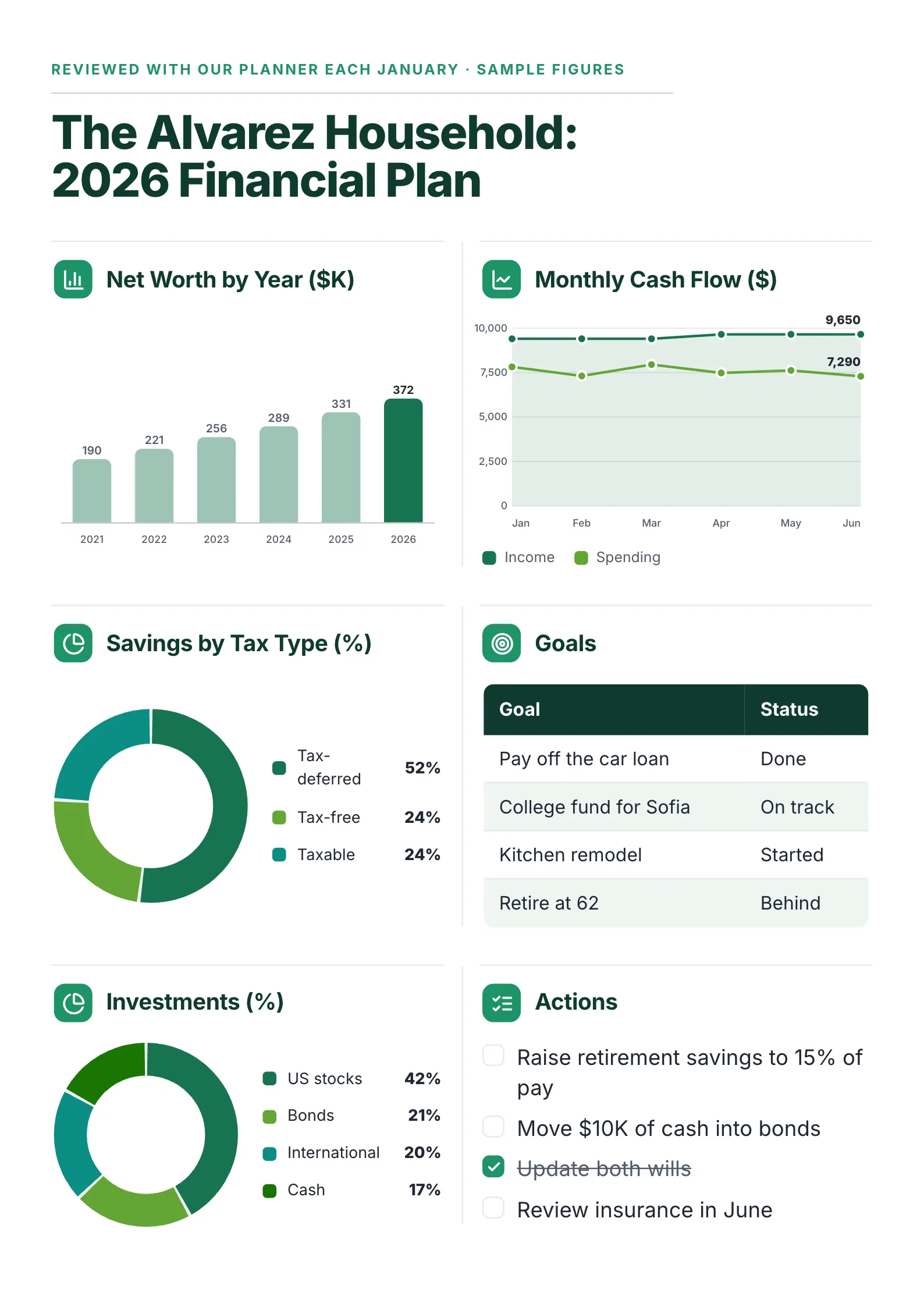 Financial Planning One-PagerEdit for free(opens in a new tab)
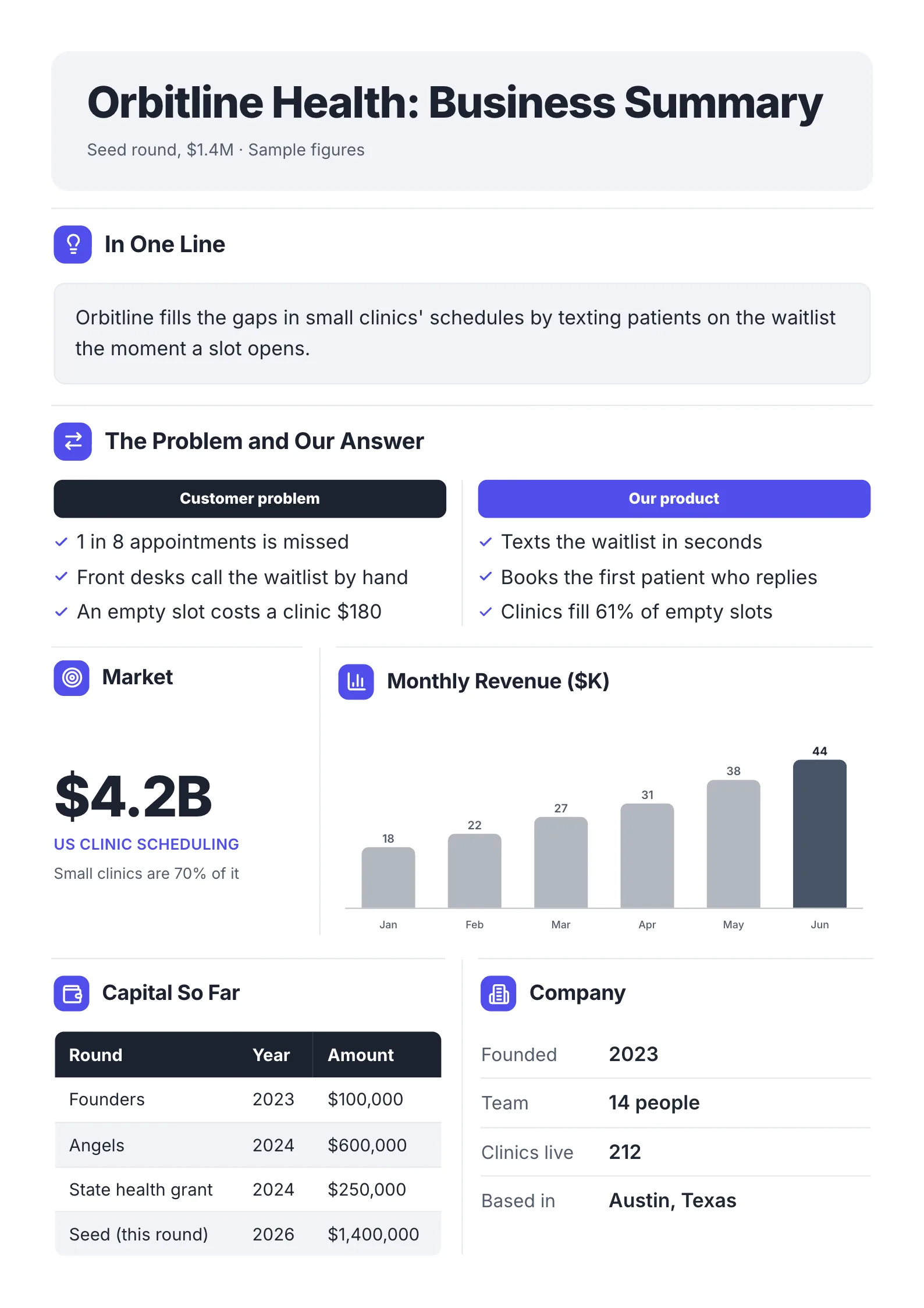 Business Summary for InvestorsEdit for free(opens in a new tab)
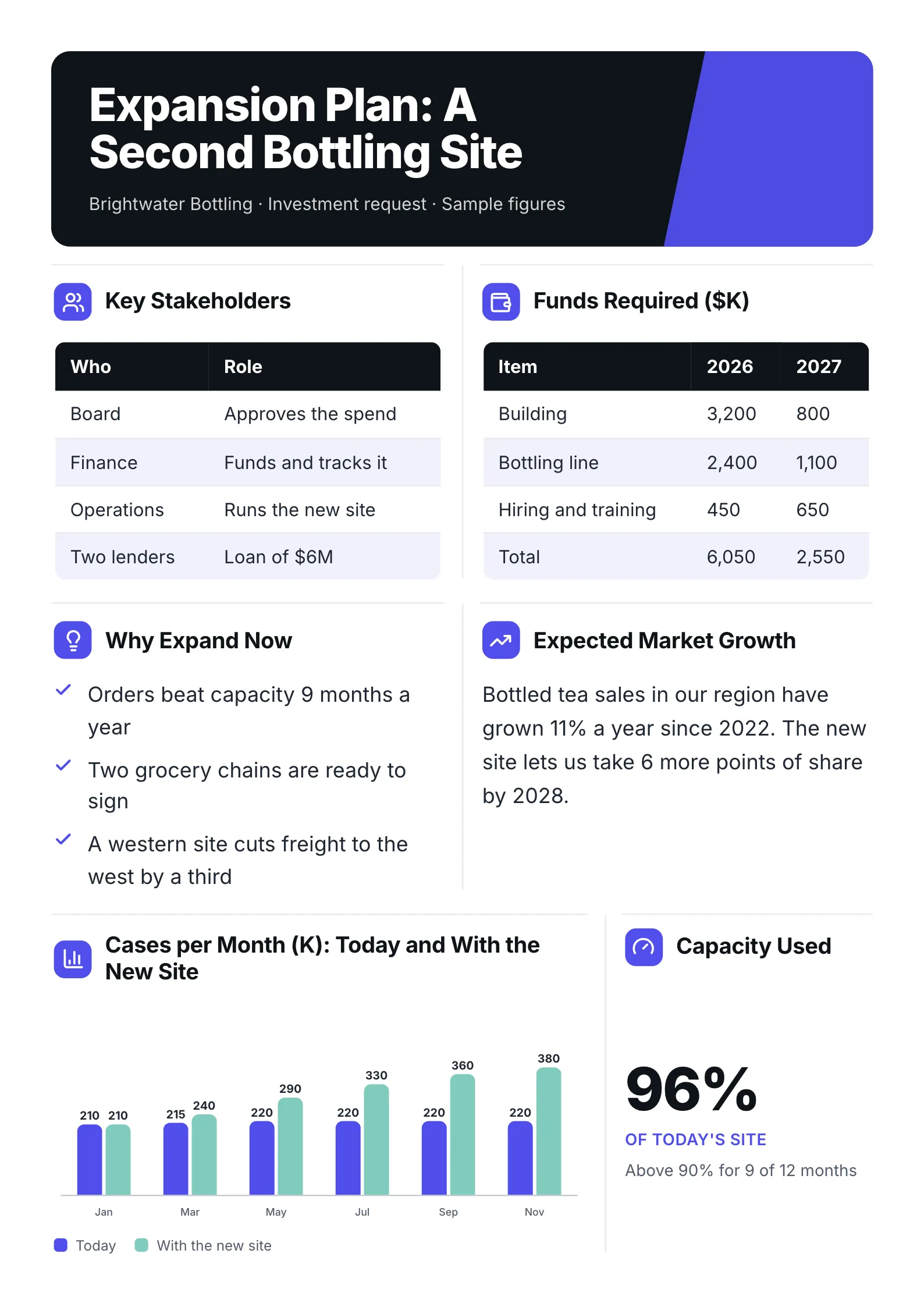 Business Expansion InvestmentEdit for free(opens in a new tab)
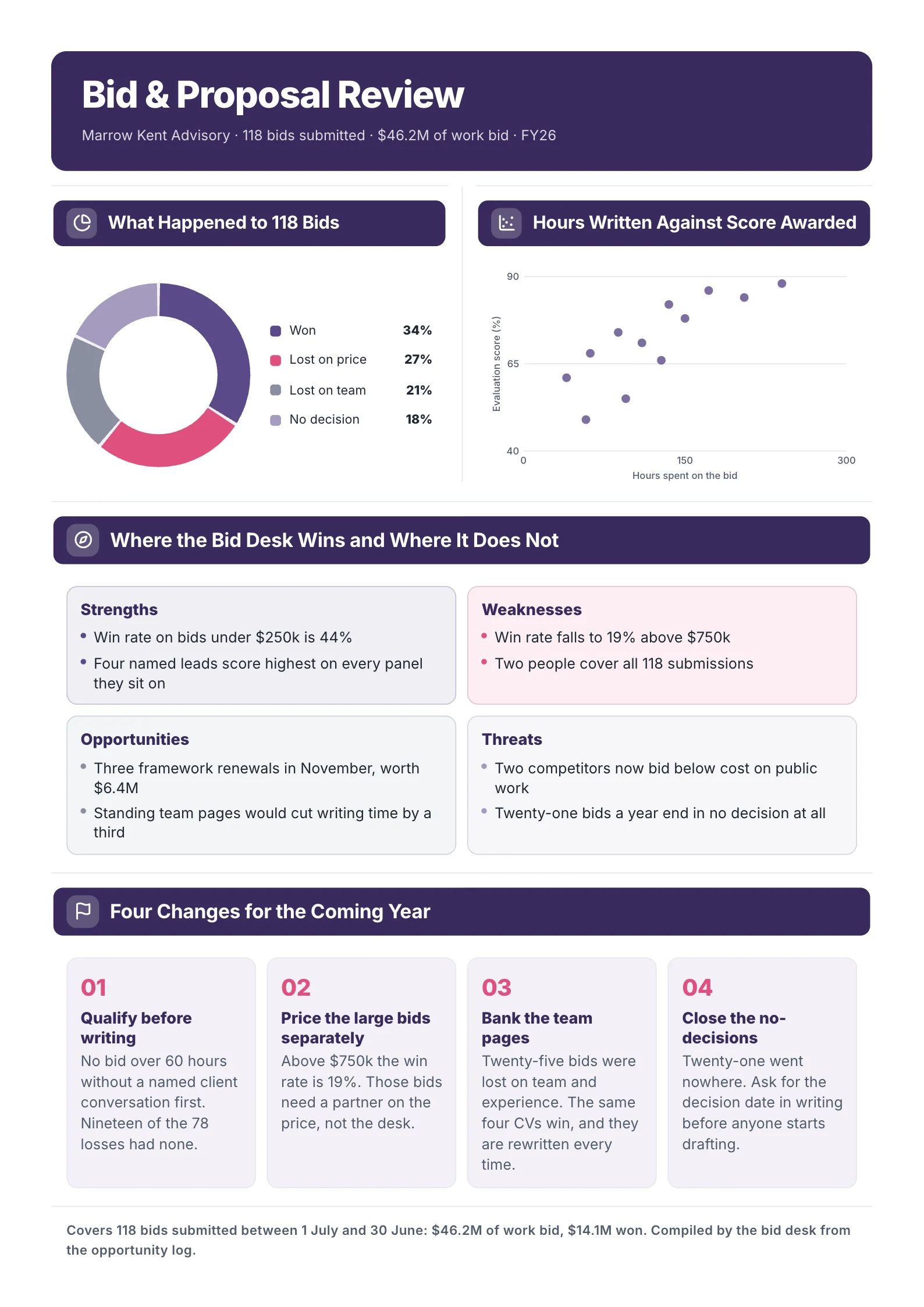
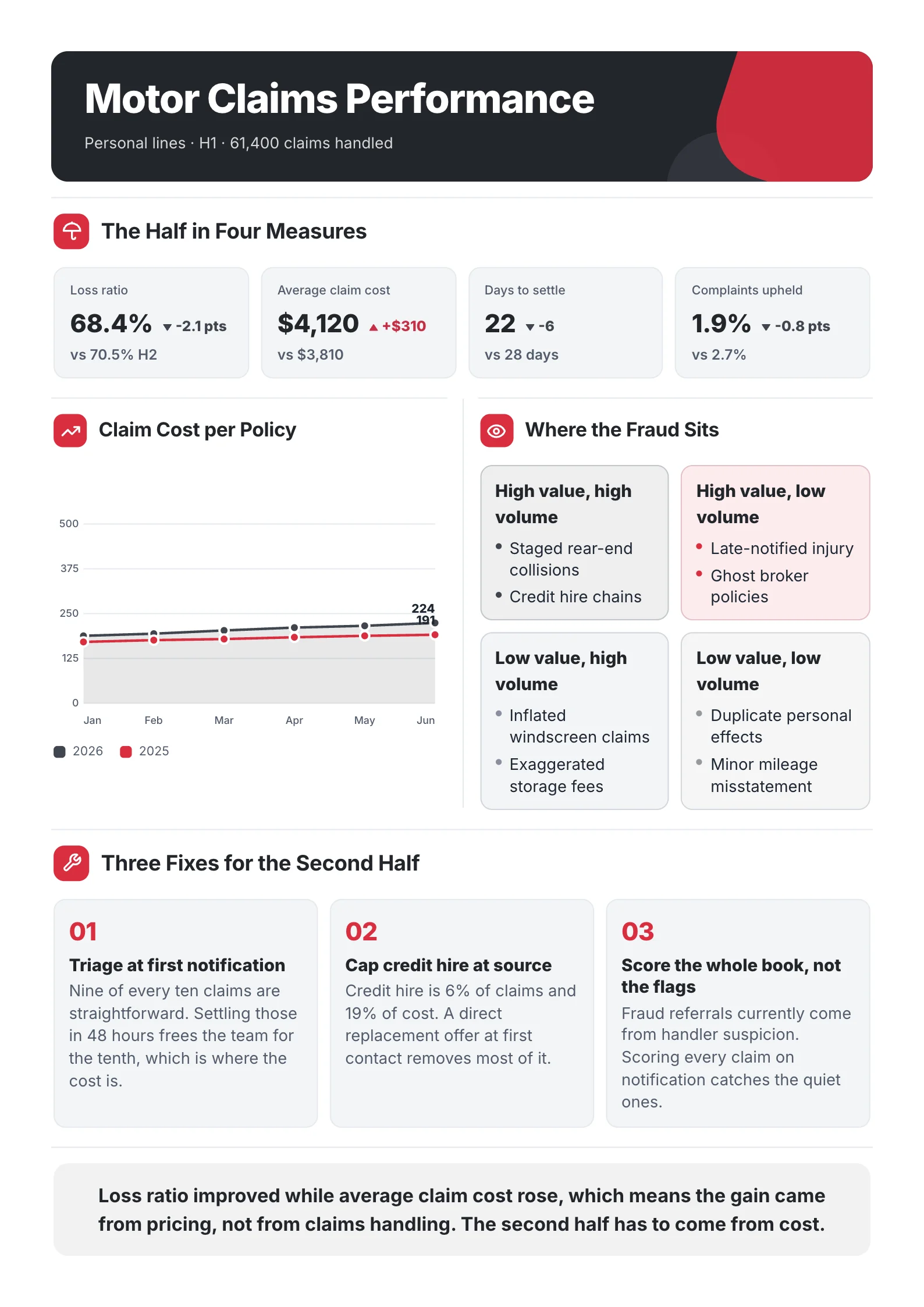
To see what actually makes a page read as an infographic, we sorted every template our team designed for the MakeOnepagers library by its parts: how many are charts, number tiles or diagrams, and how many words the page carries in total. Below are the findings, six infographic one-pager examples with their scores, and how to build one.
What is an infographic one-pager?
An infographic one-pager is a one-page document designed so the visuals come first. Where a regular one-pager is mostly headings and short paragraphs with a chart or two, an infographic one-pager is mostly charts, ring charts, number tiles, timelines and icon rows, with only a short line of text beside each.
It is still a document, not a poster. It has a title, a clear order from top to bottom, real figures with their source or date, and one thing the reader should do or remember. It is usually printed on Letter or A4, or sent as a PDF.
What we measured on our own templates
We counted the parts of each template in our library on 12 October 2026 and put each part in one of two groups.
- Visual parts: charts (bar, line, area, donut, ring and pictogram charts), number tiles (big figures with a label) and diagrams (timelines, milestones, flows, cycles and risk grids).
- Text parts: paragraphs, bullet lists, checklists, quotes, tables and callouts. Contact details and footers were left out.
Then we counted every word a reader sees on the page: the title, headings, labels, figures and text.
| Group | Share of our library | Median words per page |
|---|---|---|
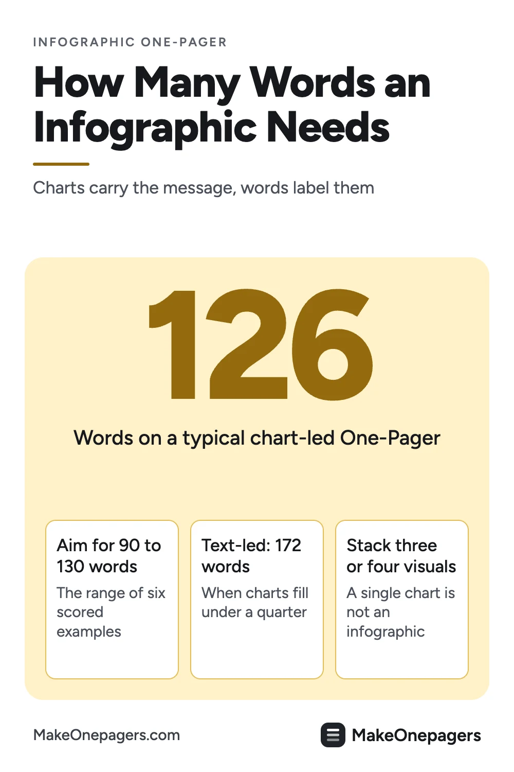
| Visual-led: half or more of the parts are visuals | 34% | 126 |
| Mixed | 39% | Between the two |
| Text-led: under a quarter of the parts are visuals | 27% | 172 |
Three findings came out of it.
- Infographic pages carry about a quarter fewer words. The visual-led median is 126 words, against 172 for text-led pages. That is the real difference: not fewer facts, but facts shown as a chart instead of a sentence.
- Half of all our templates have at least one chart, but only 1 in 10 has two or more. A single chart does not make a page an infographic. The pages that read as infographics stack three or four visuals.
- The most visual pages stop at four parts in five. None is all visuals. Every one keeps at least one part for words: a quote, a checklist or a list of next steps.
6 infographic one-pager examples, scored
Each example below is a template from our library. The score line gives the words on the page and how many of its parts are visuals. Each one opens as a template you can edit for free: every word, chart and color.
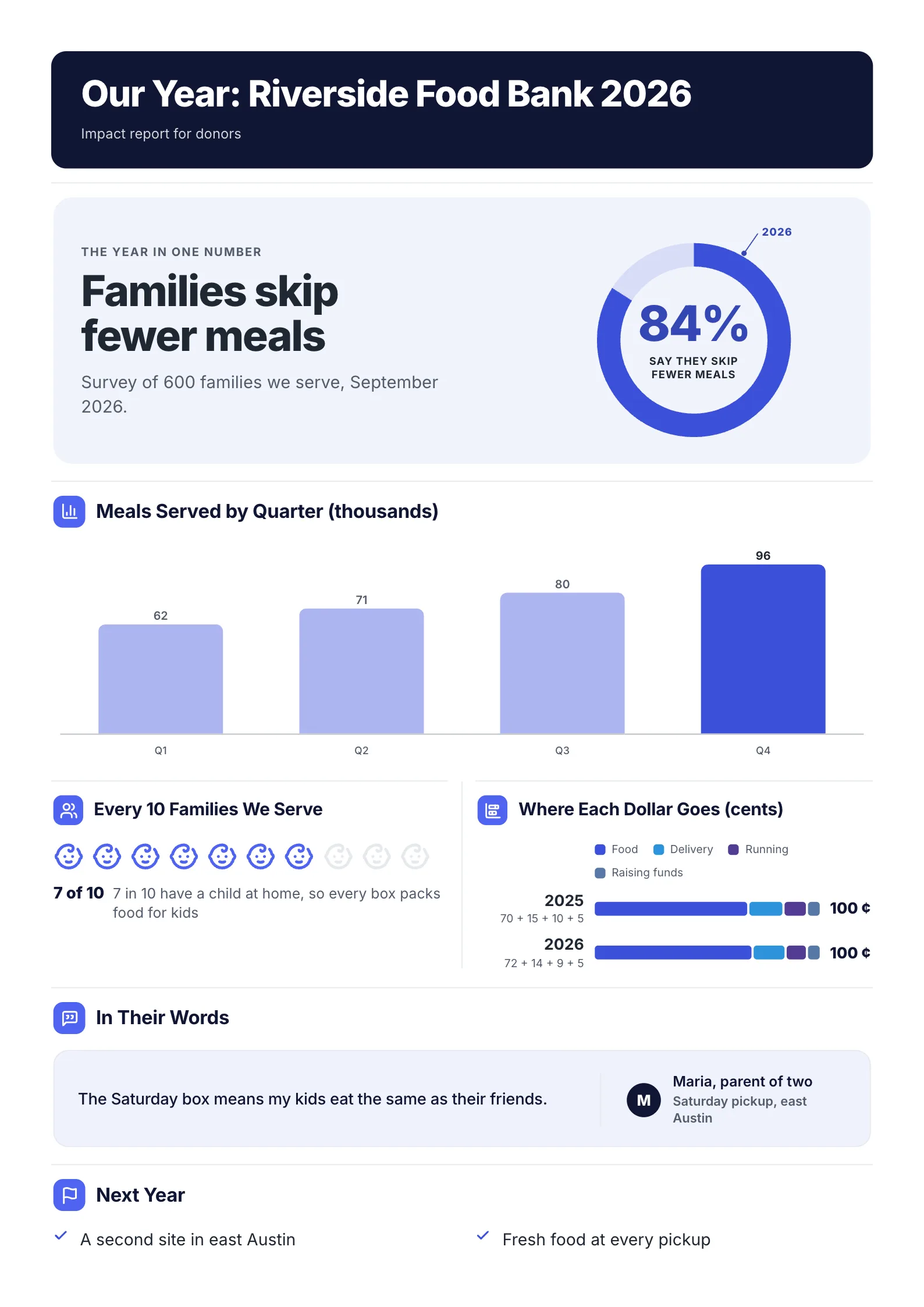
1. Nonprofit impact report: 104 words, 4 of 6 parts are charts
 Edit this template
Four different charts, each answering a different donor question, and one quote to make it human.
What to copy:
- The year in one number, in a ring chart at the top: 84% of families say they skip fewer meals, with the survey size and month under it.
- A different chart for each question. Bars for growth over the year, an icon row for "7 in 10 have a child at home", a stacked bar for where each dollar goes.
- One quote from a person helped. It is the only full sentence on the page, so it gets read.
Edit for free: impact report template.
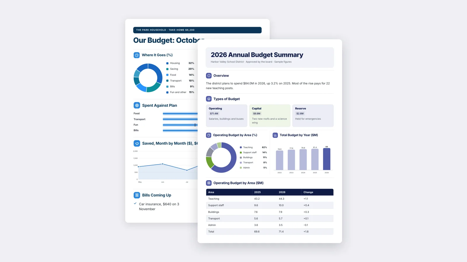
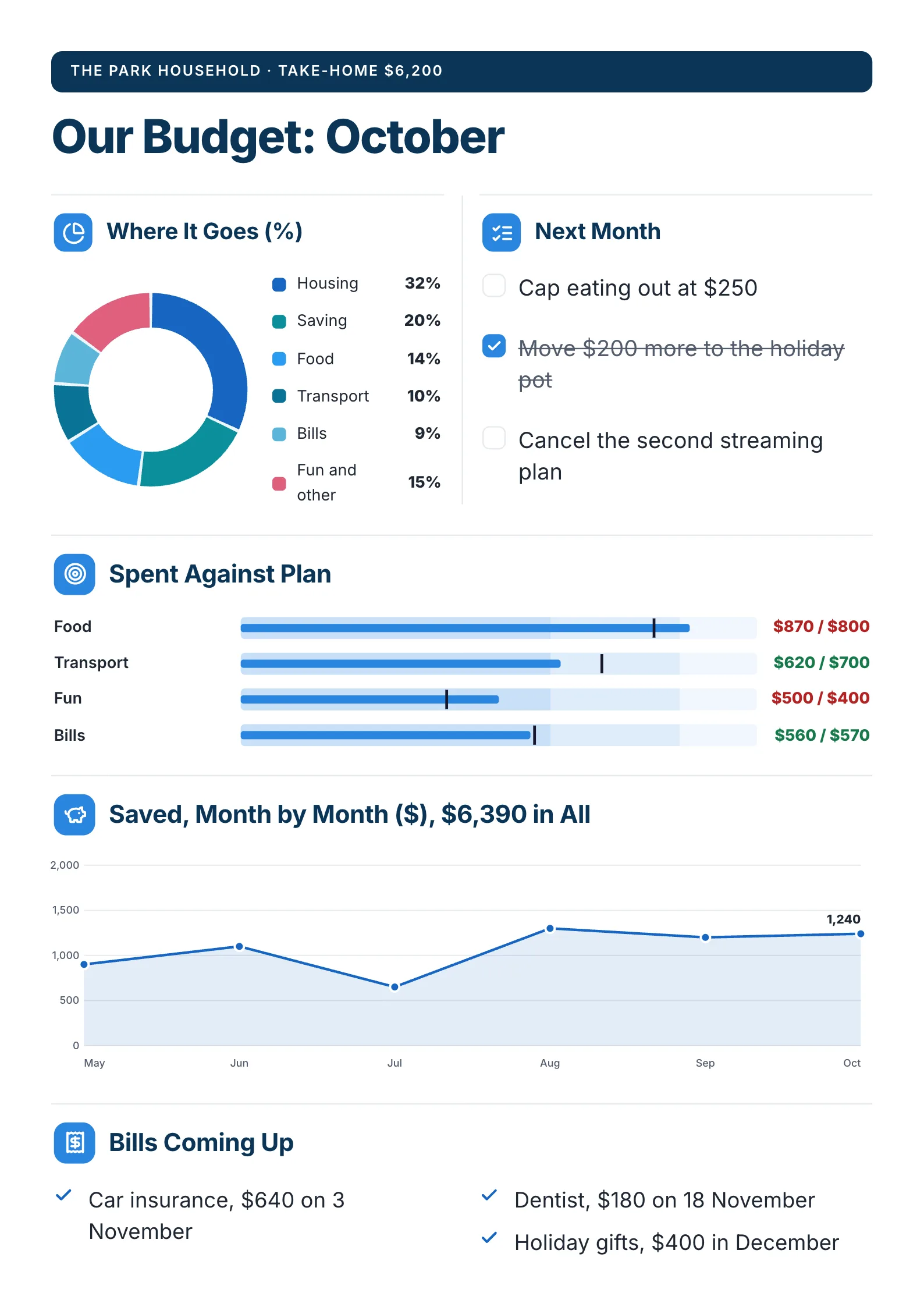
2. Household budget: 93 words, 3 of 5 parts are charts
 Edit this template
The fewest words of the six, because every number sits in a chart.
What to copy:
- Spent against plan as bullet bars, with the over-budget lines in red: food $870 against $800, fun $500 against $400.
- The running total in the chart title: "Saved, Month by Month ($), $6,390 in All". The reader gets the answer without reading the line.
- A short checklist beside the donut for what changes next month.
Edit for free: personal budget template.
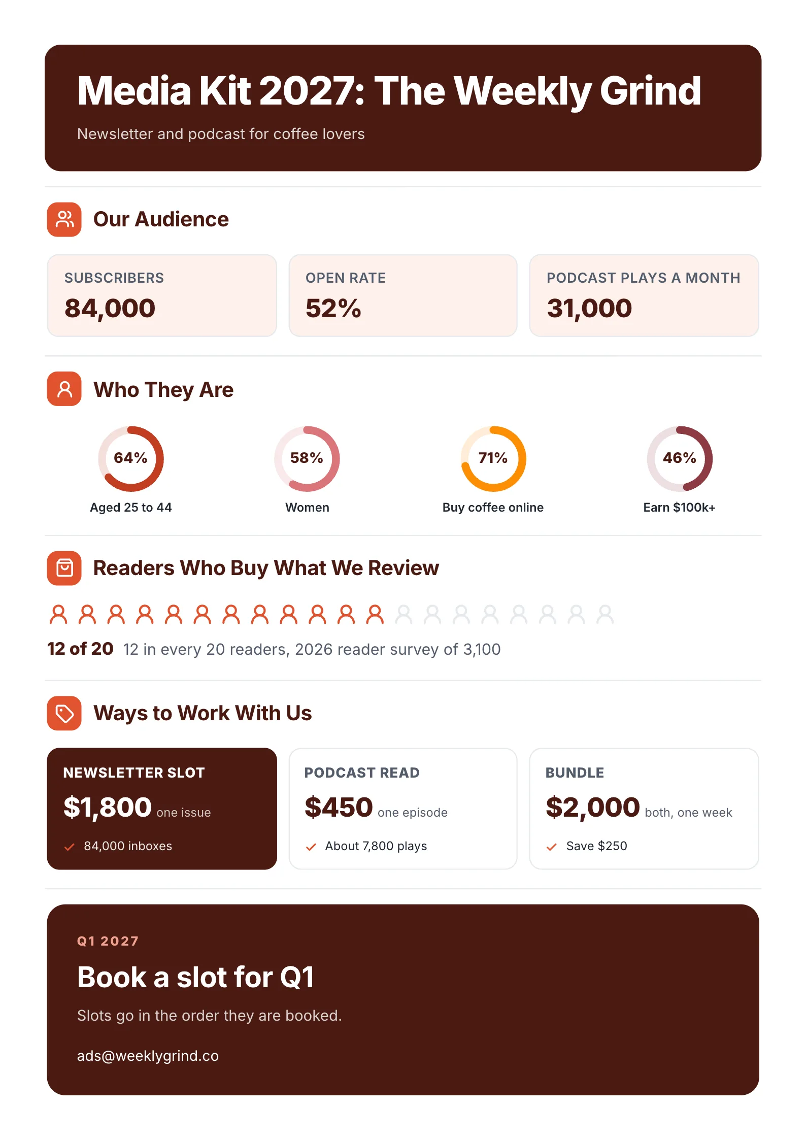
3. Media kit: 96 words, 3 of 4 parts are visuals
 Edit this template
A media kit is an infographic by nature: advertisers buy numbers.
What to copy:
- Three number tiles first: subscribers, open rate, podcast plays a month.
- Four small ring charts for the audience, each with one label: aged 25 to 44, women, buy coffee online, earn $100k+.
- An icon row with its source: 12 in every 20 readers, from a 2026 reader survey of 3,100.
Edit for free: media kit template.
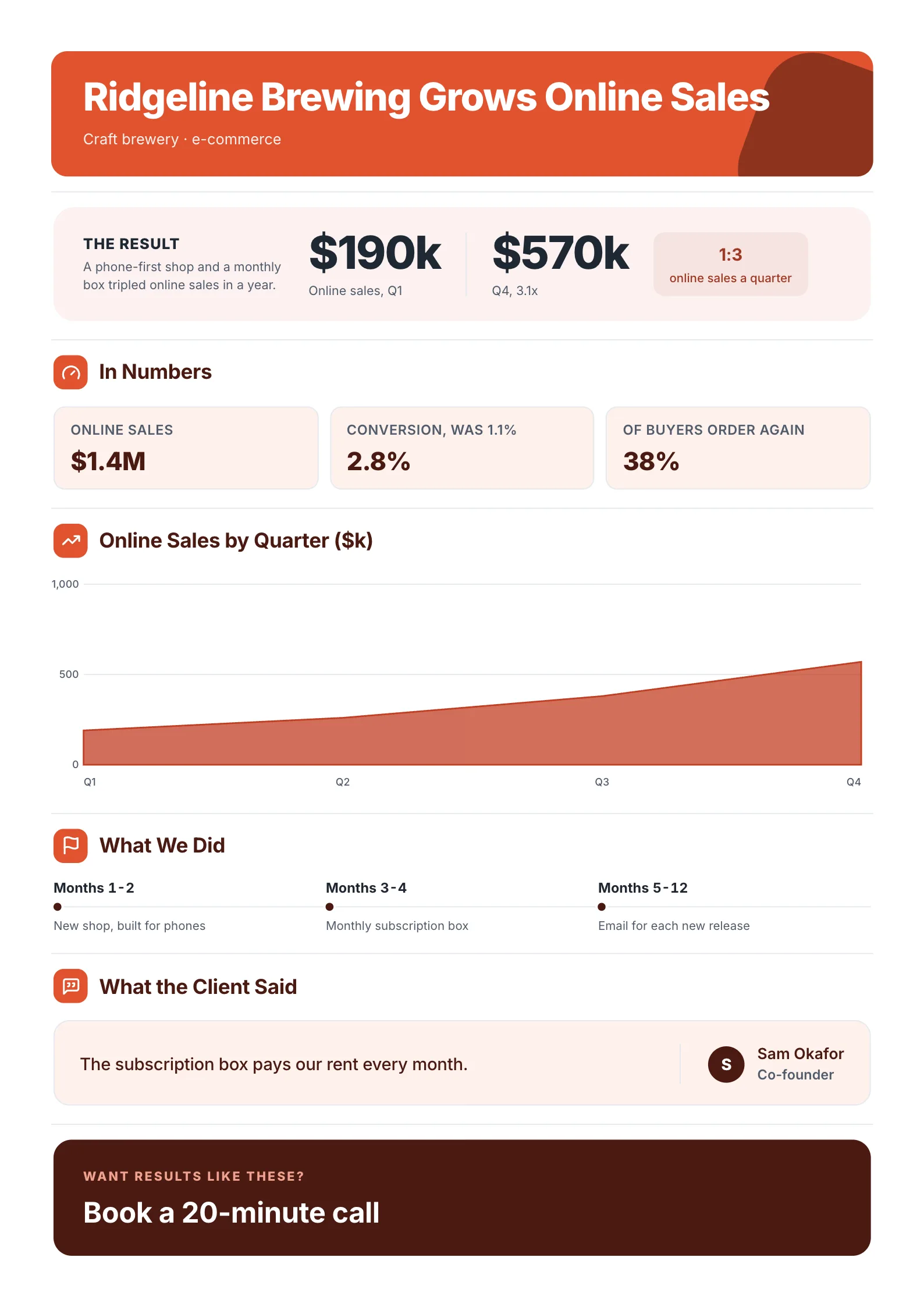
4. Case study: 107 words, 4 of 5 parts are visuals
 Edit this template
Before and after in two numbers, then the chart that proves it.
What to copy:
- The result as a before and after: $190k online sales in Q1, $570k in Q4, with "3.1x" under it.
- A three-step timeline for what was done, months 1-2, 3-4 and 5-12, instead of a paragraph.
- The chart under the claim, so the reader sees the growth was steady, not one lucky quarter.
Edit for free: case study template.
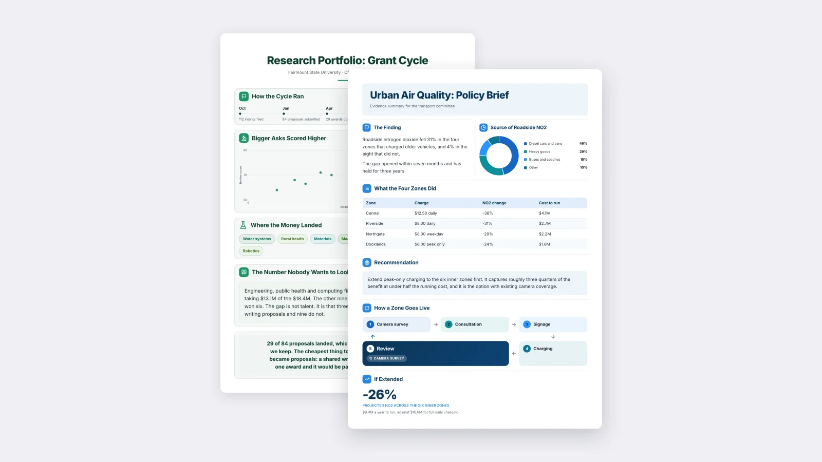
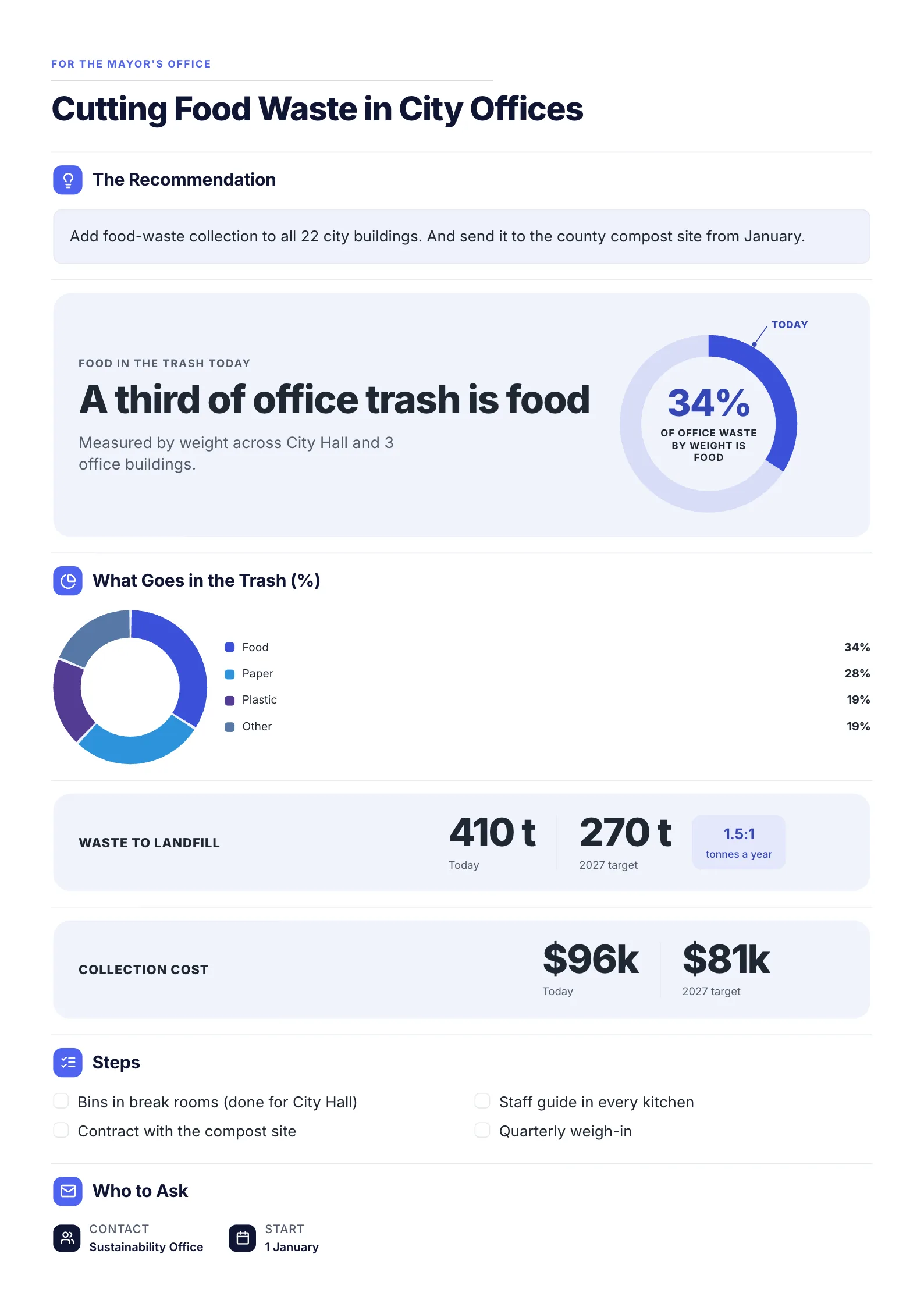
5. Policy brief: 125 words, 4 of 6 parts are visuals
 Edit this template
A decision page: the ask in one sentence, then the numbers that justify it.
What to copy:
- The recommendation above every chart, so the reader knows what the numbers are for.
- Today against the target, side by side: 410 tonnes to 270, $96k to $81k.
- A plain-English headline on the big number: "A third of office trash is food" says what 34% means.
Edit for free: policy brief template.
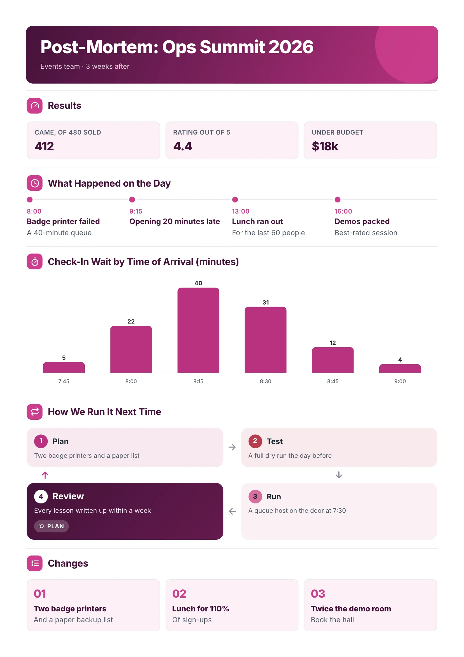
6. Event post-mortem: 129 words, 4 of 5 parts are visuals
 Edit this template
A chart that finds the problem: the morning queue peaks at 8:15.
What to copy:
- A chart that answers "where did it go wrong": check-in wait by time of arrival peaks at 40 minutes at 8:15. The timeline above it gives the cause, a badge printer that failed at 8:00.
- The day as a timeline, with what went wrong at each time.
- Three numbered changes at the bottom, so the page ends on what happens next.
Edit for free: post-mortem template.
Which chart for which number
Pick the chart from the question the number answers.
| The question | Use | From the examples |
|---|---|---|
| How did it change over time? | Bar or line chart | Meals by quarter, savings by month |
| What is it made of? | Donut chart or stacked bar | Where the money goes, what is in the trash |
| How many out of how many? | Icon row | 7 in 10 families, 12 in 20 readers |
| One headline percentage | Ring chart | 84% skip fewer meals |
| Actual against target | Bullet bars | Spent against plan |
| Before and after | Two big numbers | $190k to $570k |
| What happened when? | Timeline | The event day, the project months |
If a chart could be replaced by one sentence with one number in it, use the big number instead. A chart earns its space when it shows a shape: a rise, a peak or a split.
How many words should an infographic one-pager have?
Aim for about 90 to 130 words. That is the range of the six examples above, and the visual-led pages in our library have a median of 126. A text-led one-pager in the same library carries a median of 172, and a full page of prose holds several hundred more. Our guide on how many words fit in a one-pager has the full measurements.
Most of those words should be labels: chart titles, axis names and the line under each big number. If you are writing full sentences, keep it to two or three: the headline, a quote and the call to action.
Lead with one big number
Four of the six examples open with a big number as their very first part: 84% of families, 84,000 subscribers, $190k to $570k, and 412 people. The policy brief puts its recommendation first and its big number, a third of office trash, straight after. Pick the one number you would say if you had five seconds, make it the largest thing on the page, and write a plain sentence beside it that says what it means.
Infographic one-pager or a regular one-pager?
| Choose an infographic one-pager when | Choose a regular one-pager when |
|---|---|
| The message is numbers | The message is an argument or a plan |
| The reader will glance at it | The reader will read it in a meeting |
| It goes on a wall, a screen or social media | It goes to a decision-maker who wants reasons |
| You have 3 or more figures worth showing | You have one or two figures |
Many good pages sit in between: a regular one-pager with one strong chart, or an infographic with a short paragraph of context. Our 20 one-pager ideas show both kinds.
How to make an infographic one-pager
- Write the one sentence the page must say. "Our food bank fed more families this year" is the impact page in one line.
- List every number you have, then keep the four or five that prove the sentence.
- Match each number to a chart with the table above.
- Put the biggest number first and the action last.
- Title every chart with what it shows, not what it is: "Meals Served by Quarter (thousands)", never "Chart 1".
- Use two or three colors. One for the main data, one for comparison, gray for the rest.
- Check it at arm's length. If you cannot tell what the page is about from a meter away, the top number is too small.
Infographic one-pager mistakes
- Charts as decoration. A chart with no title or no takeaway is a picture, not information.
- Every figure in a chart. Two numbers do not need a chart. Show them as big numbers side by side.
- Too many colors. Each new color asks the reader to learn what it means.
- Pie charts with many slices. Past five or six slices, the small ones cannot be compared. Group them as "Other", as the food waste example does.
- No source or date. "84% of families" needs "survey of 600 families, September 2026" under it to be believed.
Make your infographic one-pager
Open one of the six free templates above, start with the impact report template if you are not sure which, replace the sample numbers with yours and download it as a PDF.
Frequently asked questions
What is an infographic one-pager?
A one-page document where charts, big numbers, icons and diagrams carry most of the message, and the text only labels them. It is used for impact reports, budgets, case studies, media kits and policy briefs.
How do you make an infographic one-pager?
Write the one sentence the page must prove, keep the four or five numbers that prove it, give each number the chart that fits its question, put the biggest number first and the action last. Starting from a designed template, such as the impact report template, saves the layout work.
How many words should an infographic one-pager have?
About 90 to 130. The six examples here carry 93 to 129 words each, and the visual-led pages in our template library have a median of 126.
What size is an infographic one-pager?
The same as any one-pager: US Letter (8.5 by 11 inches) in the US and Canada, A4 almost everywhere else. Our guide to one-pager dimensions covers both, plus the pixel sizes for screens.
What is the difference between an infographic and a one-pager?
An infographic can be any length and is often a long scrolling graphic. A one-pager is one page. An infographic one-pager is both: a one-page document designed with visuals first.