Guide
How to Make a One‑Pager: A Step-by-Step Guide With Examples
How to make a One-Pager in 6 steps: pick one reader, lead with the point, keep the numbers that matter, and design it for a two-minute read.
Updated · 6 min read
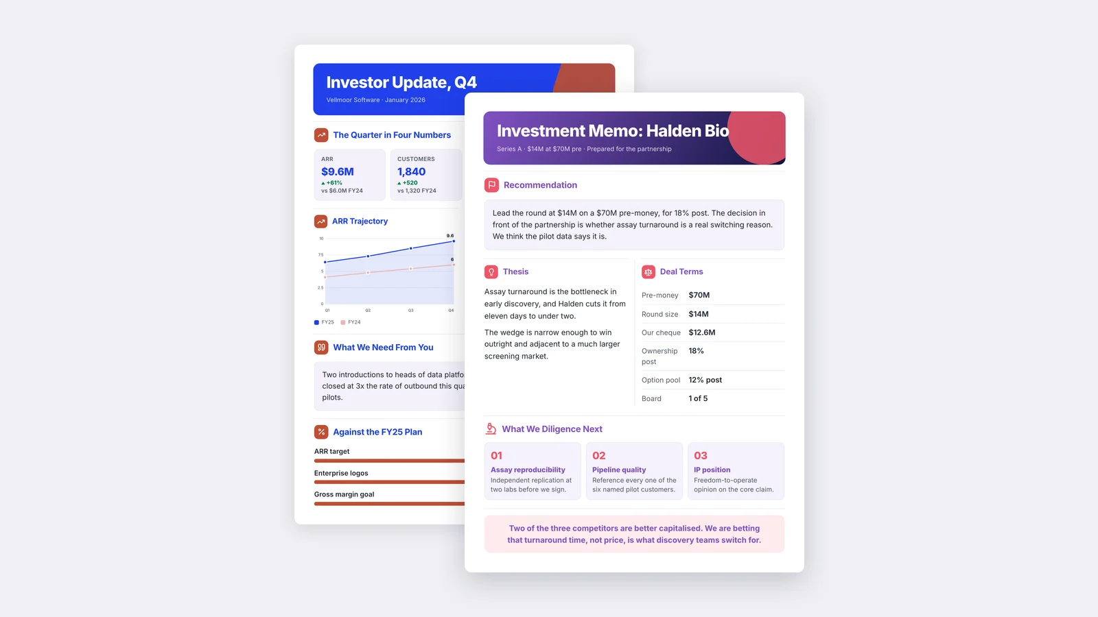
A One-Pager is a single sheet that tells one reader what they need to know to make one decision. To make one, you pick that reader, write the conclusion first, keep only the facts that support it, and lay it out so the eye lands on the point before anything else. The whole job takes six steps, and the hardest one is deciding what to leave out.
This guide walks through each step, shows how to build a One-Pager in Word, Google Docs, PowerPoint or with AI, and ends with a checklist you can run before you hit send.
What a good One-Pager actually does
Most One-Pagers fail for the same reason: they try to be the whole report, only smaller. A good one is not a shrunken report. It is a decision tool.
It answers three questions in order:
- What is this about? One line, in plain words.
- What should I know or do? The conclusion, the recommendation, or the ask.
- Why should I believe it? The three to five facts that back it up.
Everything else, the method, the history, the appendix, stays in the source document. Link to it if the reader needs it.
Step 1: Pick one reader and one decision
Before you write a word, finish this sentence: "After reading this, will ."
"The board will approve the Q3 budget." "A new client will book a call." "My manager will know whether the launch is on track."
If you cannot finish the sentence, you are not ready to write. If you finish it with two readers, you need two One-Pagers. A One-Pager written for the CFO and the sales team at once serves neither of them.
Step 2: Write the headline as the answer
The headline is not a label. "Q3 Marketing Review" tells the reader nothing. "Paid search drove most new trials in Q3; we should move budget from display" tells them the whole story before they read another line.
Write the headline last if it helps, but put it first on the page. A reader who only reads the headline should still walk away with the main point.
Step 3: Keep only the facts that support the point
Go through your source material and sort every fact into one of two piles: "supports the decision" and "interesting but not needed." Only the first pile goes on the page.
Some rules that help:
- Keep the numbers, drop the narration. "Churn fell from 4.1% to 3.2%" beats a paragraph explaining churn.
- Give every number its comparison. A figure on its own means nothing. Put last quarter, the target, or the benchmark beside it.
- Three to five supporting points is the range. Fewer feels thin. More, and the reader stops reading.
Step 4: Choose a layout that matches the content
The layout should follow what you are saying, not the other way round. Common structures:
| Purpose | Layout that works |
|---|---|
| Status update or report | Headline, three key metrics in a row, short sections for wins, risks and next steps |
| Pitch or proposal | Problem, solution, proof, the ask, contact |
| Product or service sheet | What it is, who it is for, three benefits, pricing or next step |
| Research summary | Question, finding, method in one line, what it means |
If you want to see these in practice, browse real One-Pager examples by field, or start from a One-Pager template built for your use case.
Step 5: Design for a two-minute read
Design is what makes the page readable at a glance. You do not need to be a designer, but you do need a few habits:
- One focal point. The headline or the key number should be the biggest thing on the page.
- White space is not wasted space. Margins and gaps between sections are what let the eye find its way.
- Short sections with clear subheadings. A reader should be able to scan the subheadings alone and follow the story.
- One chart, if any. A single chart that proves the main point beats four that compete with it.
- Your brand, applied the same way every time. Same fonts, same colors, logo in the same place.
Step 6: Cut, then cut again
Read the draft as the reader. Every sentence that does not help them make the decision comes out. Then print it or view it at actual size. If you have to shrink the text to fit, you have too much on the page, not too small a font.
How to make a One-Pager in Word, Google Docs, PowerPoint or with AI
The steps above apply whatever tool you use. Here is how each one handles the build.
In Microsoft Word or Google Docs
Set narrow margins, use a two-column table for side-by-side sections, and use the built-in heading styles so the hierarchy stays consistent. Both tools are fine for text-heavy One-Pagers. They get awkward once you want charts and sections placed exactly where you want them.
In PowerPoint or Google Slides
Change the slide size to letter or A4 portrait, then treat the slide as a canvas. Slides give you free placement of text boxes, shapes and charts, which makes them a popular choice for visual One-Pagers. The trade-off is time: aligning everything by hand is slow.
In a design tool
General design tools give you templates and full visual control. They are a good fit when you are designing from scratch and already know what goes on the page. We wrote an honest comparison of MakeOnepagers and Canva if you are weighing the two.
With AI
The slow part of a One-Pager is usually not the design. It is reading a long source document and deciding what matters. That is the part an AI One-Pager maker handles.
With MakeOnepagers, you drop in a PDF, Word doc, PowerPoint deck, link, block of text, or just a topic. It reads the source, pulls out the numbers and conclusions your reader needs, and designs the One-Pager with your brand applied. You then change anything you want before you send it. It is free for 7 days with 3 One-Pagers included.
AI does not remove Step 1. You still decide who the reader is and what they should do. It removes the hours between that decision and a finished page.
A checklist before you send
- [ ] Can I name the one reader and the one decision?
- [ ] Does the headline state the conclusion, not the topic?
- [ ] Does every number have a comparison beside it?
- [ ] Are there five supporting points or fewer?
- [ ] Is there one clear focal point?
- [ ] Does it fit on one page at a readable font size?
- [ ] Is there a clear next step or contact?
If every box is ticked, it is ready.
One‑Pager examples
Six real One-Pagers made with MakeOnepagers. Open any one to edit it as your own.
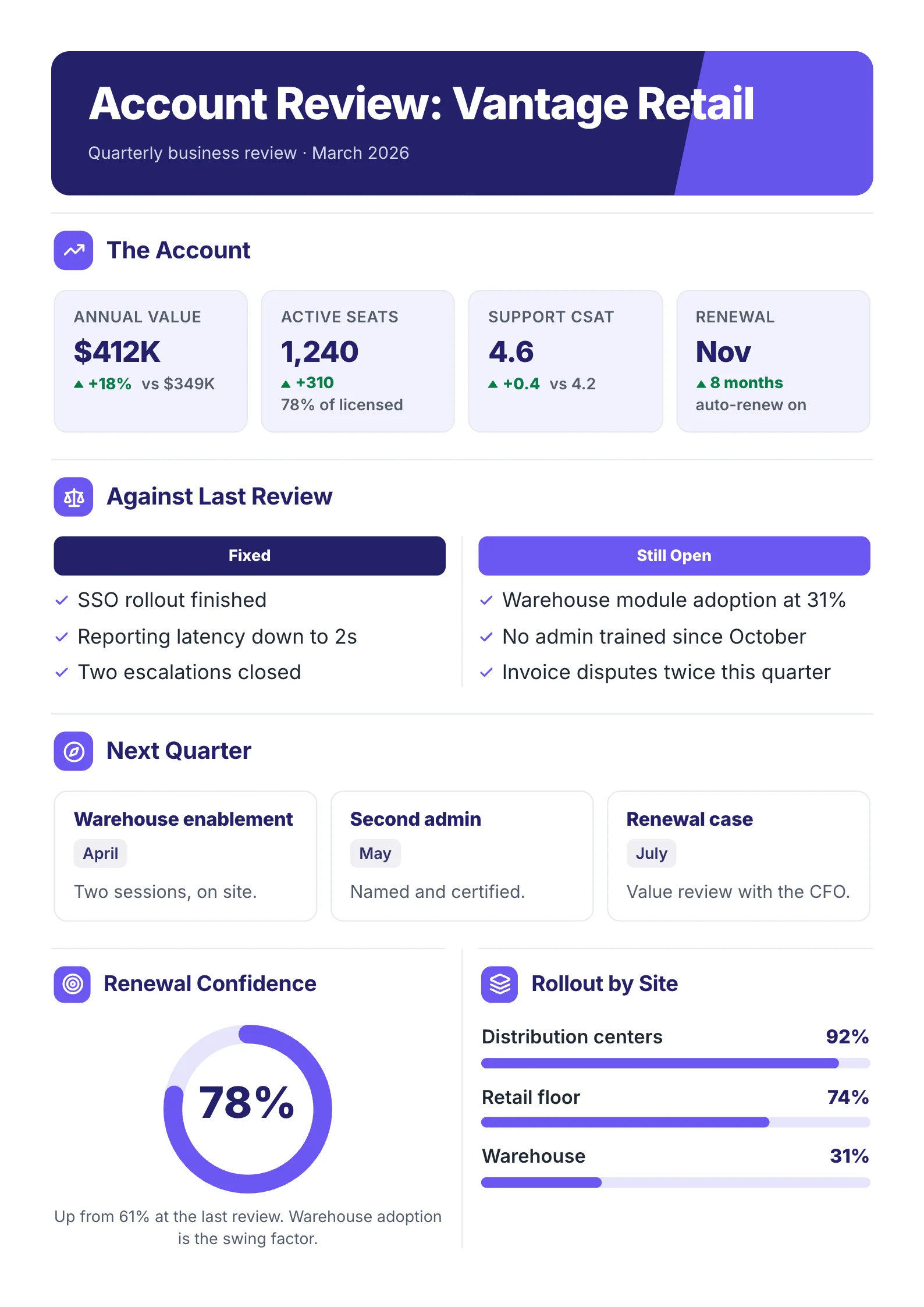 Quarterly business reviewOpen the template (opens in a new tab)
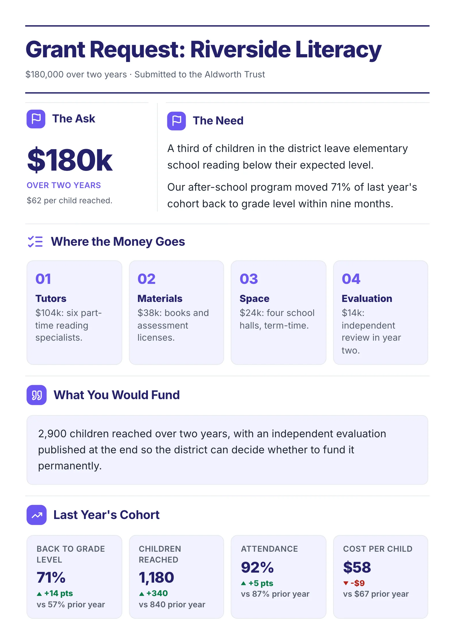 Grant requestOpen the template (opens in a new tab)
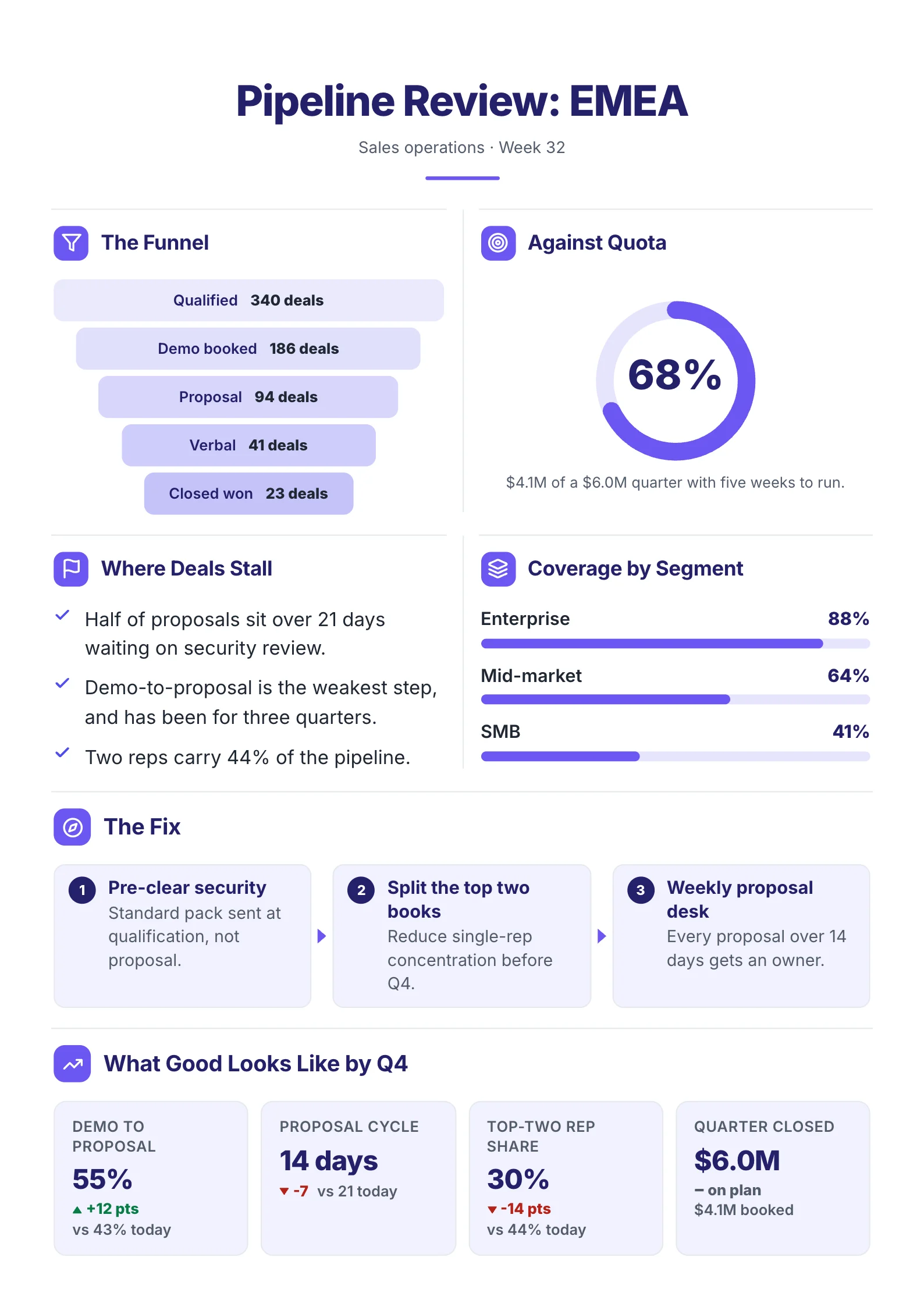 Sales pipelineOpen the template (opens in a new tab)
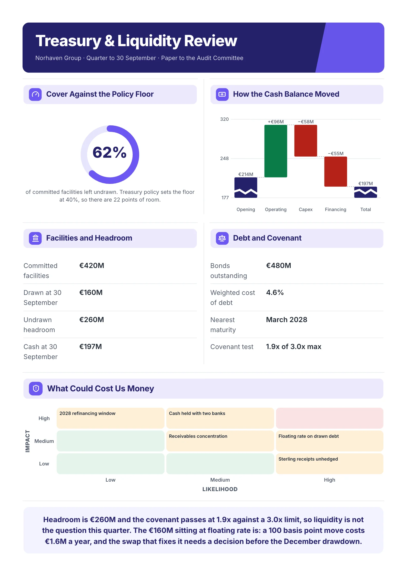 Treasury reviewOpen the template (opens in a new tab)
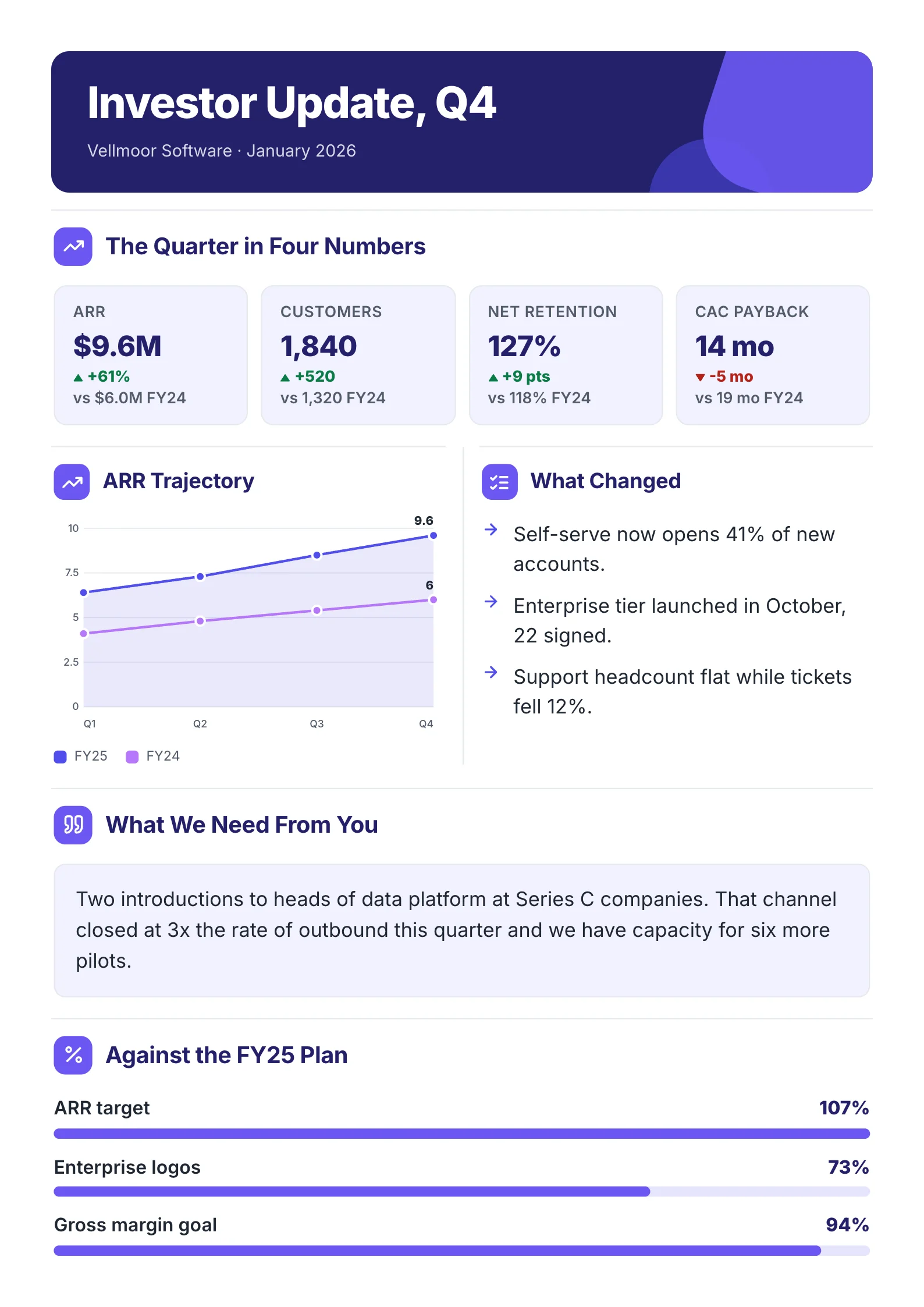 Board updateOpen the template (opens in a new tab)
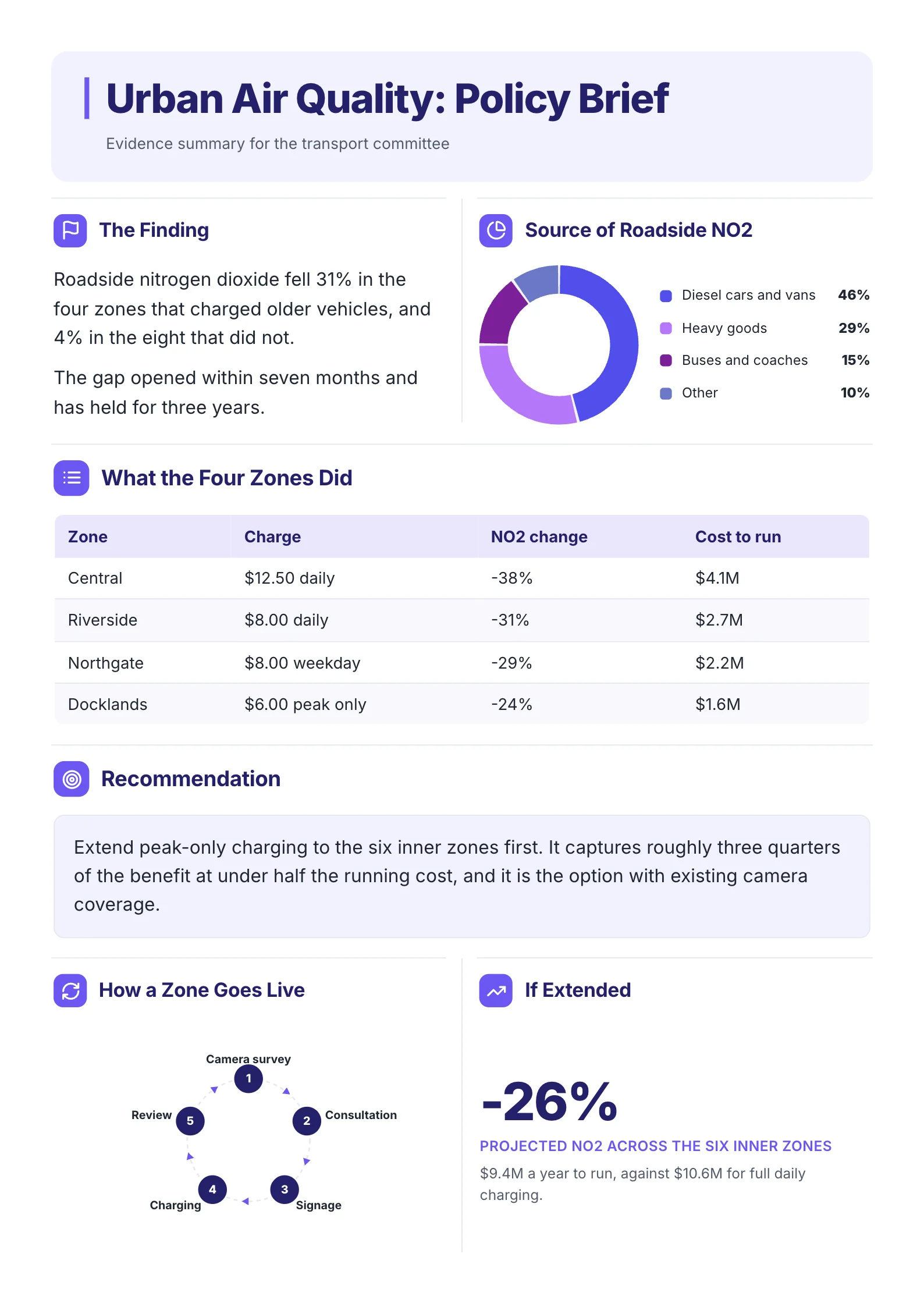 Policy briefOpen the template (opens in a new tab)
Frequently asked questions
How long should a One‑Pager be?
One page, by definition, and usually 250 to 500 words. The word count matters less than whether a reader can get the point in about two minutes. If they cannot, cut words rather than shrinking the font.
What should be included in a One‑Pager?
A headline that states the main point, three to five supporting facts with their numbers, and a clear next step or ask. Depending on the purpose, add a short problem and solution, a single chart, or contact details.
What is the difference between a One‑Pager and an executive summary?
An executive summary is usually the opening section of a longer document. A One-Pager stands on its own and is often designed to be shared or printed by itself. In practice the two overlap a lot. See our guide to writing a one-page executive summary.
Can I make a One‑Pager for free?
Yes. Word, Google Docs and Google Slides can all produce a basic One-Pager at no cost. MakeOnepagers also offers a 7-day free trial with 3 One-Pagers included.
What makes a One‑Pager look professional?
Consistent fonts and colors, generous white space, a clear hierarchy from headline to detail, and numbers presented with context. Most "unprofessional" One-Pagers are simply too full.