BlogGuide
One Pager Layout Ideas: 6 Layouts, Measured on Real One‑Pagers
One pager layout ideas measured across our whole template library: how many sections, where split rows go, and the 6 layouts that cover most of them.

By MakeOnepagers Team
Updated · 6 min read
One pager layout ideas are easy to collect and hard to choose between. So instead of another gallery, we measured. Our template library keeps a section map for every finished One-Pager: where each section sits, and which ones sit side by side. We counted them on 12 October 2026. The result is six layouts that cover most of the library, the number of sections that works, and where a split row helps. Below: the numbers, the six layouts with an example of each, and how to pick one.
One‑Pager examples
Real One-Pagers made with MakeOnepagers. Open any one to edit it as your own.
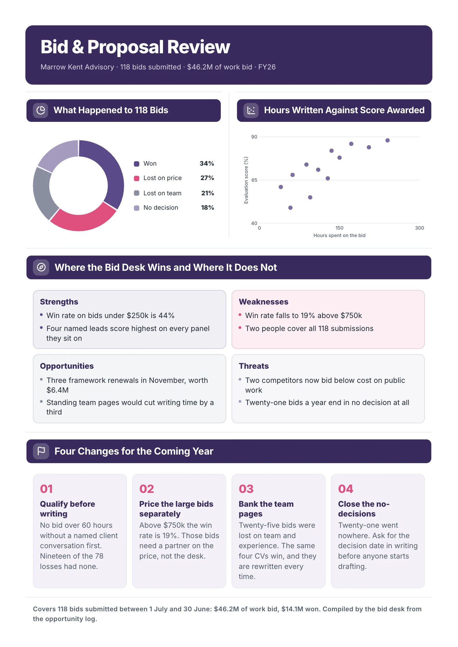
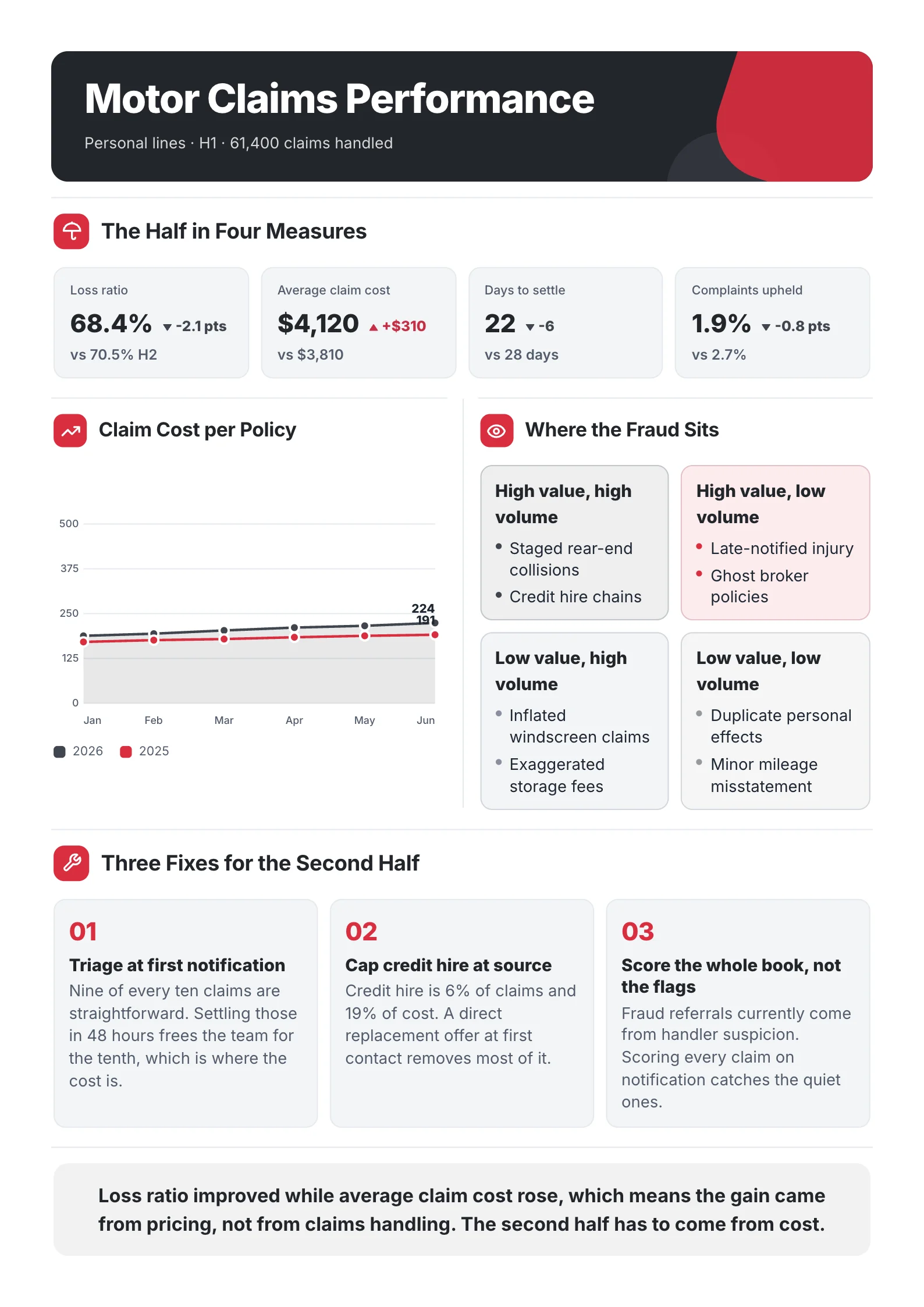
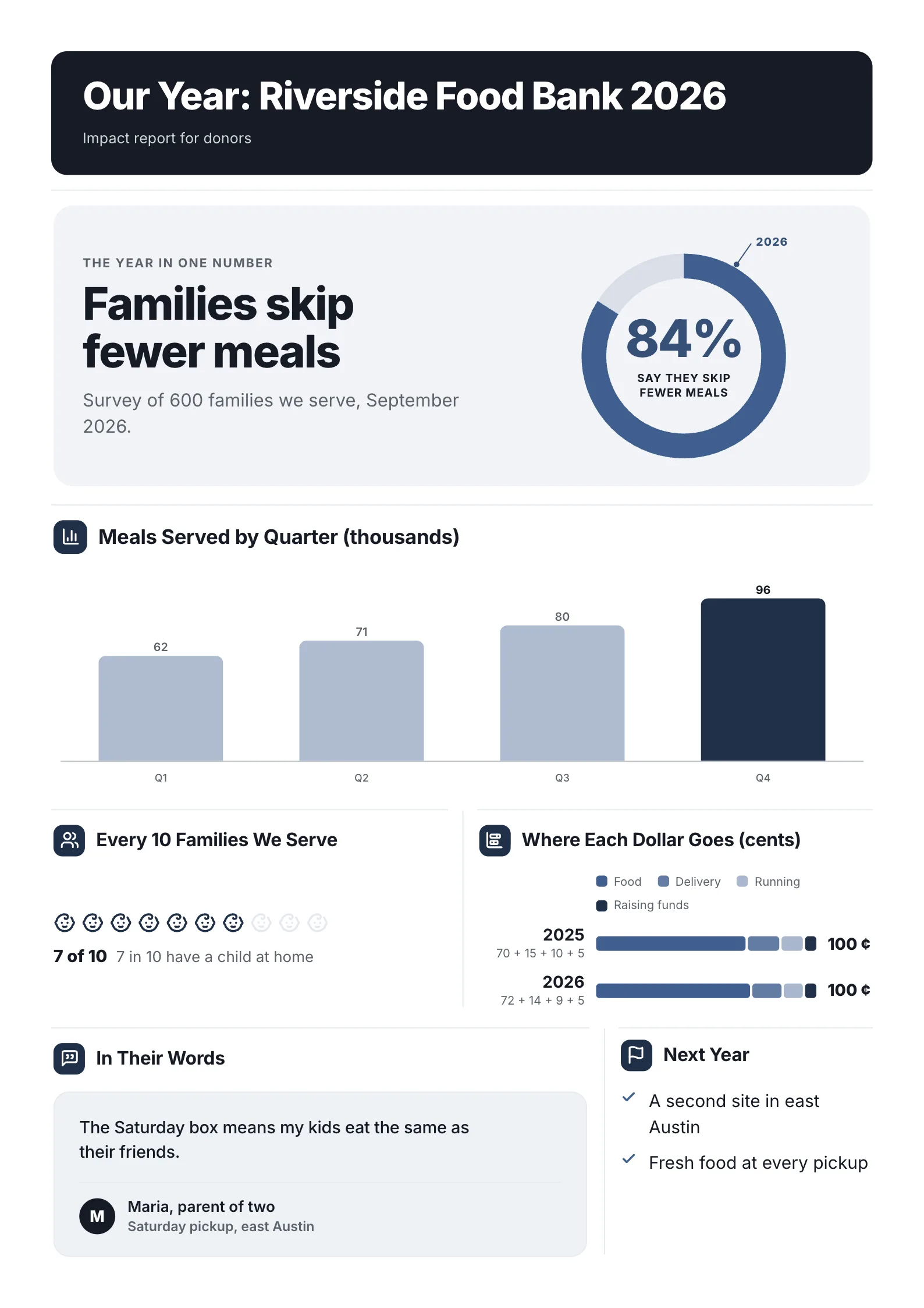 Nonprofit Impact SheetEdit for free(opens in a new tab)
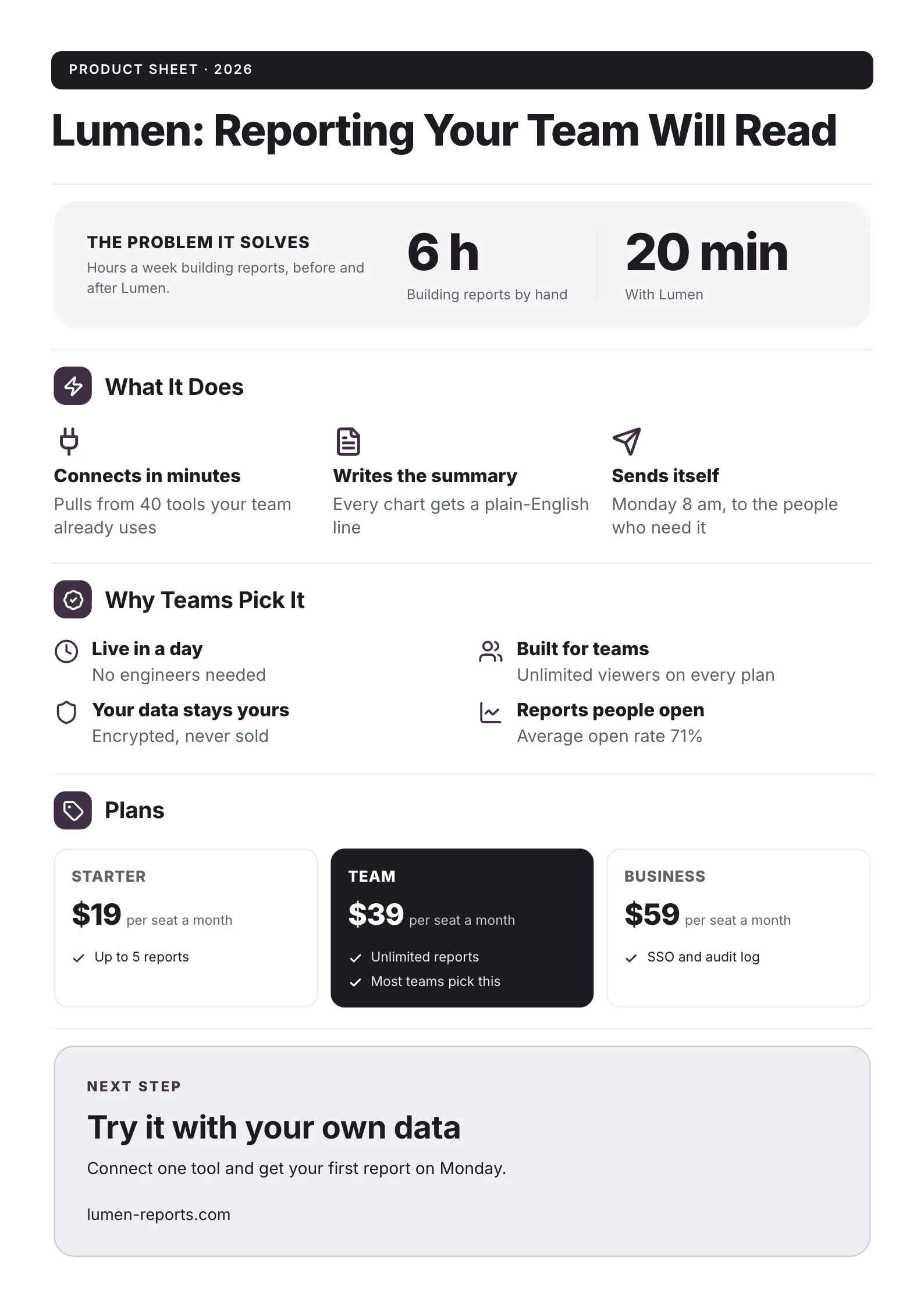 SaaS Product One-PagerEdit for free(opens in a new tab)
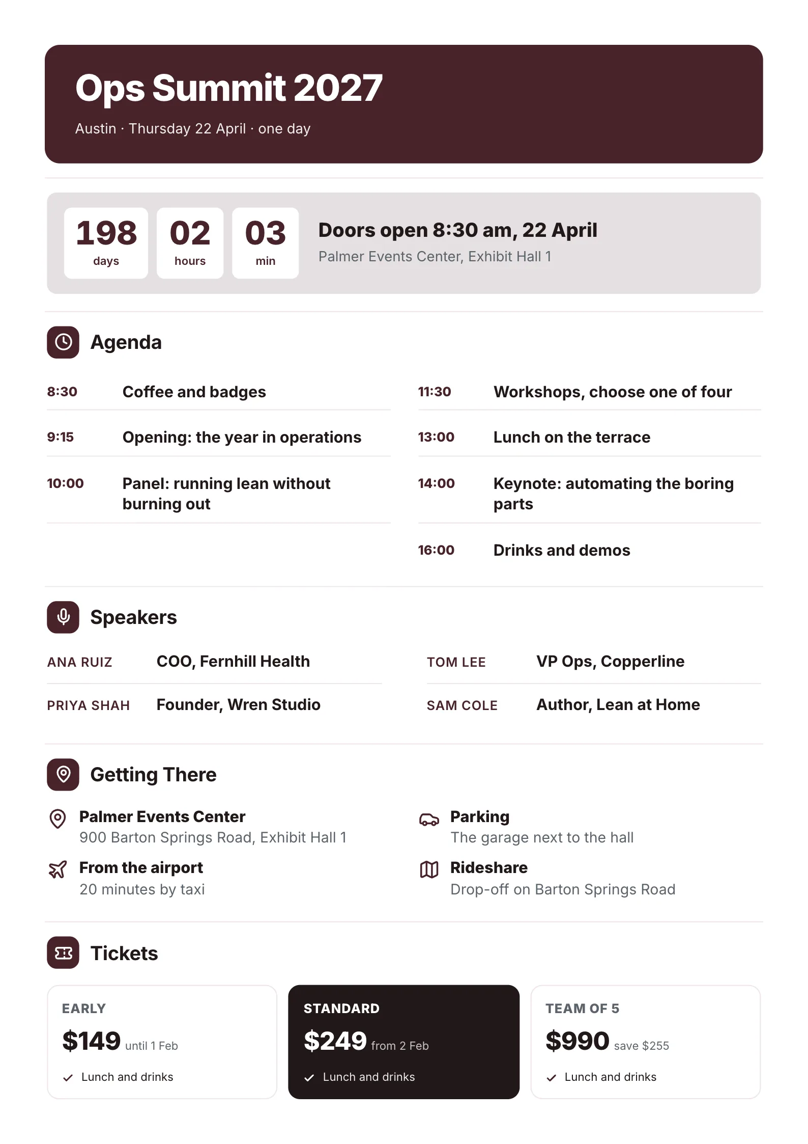 Event One-PagerEdit for free(opens in a new tab)
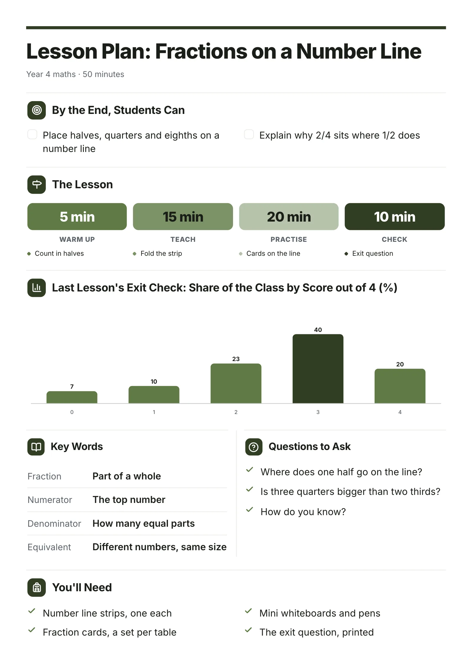 Lesson PlanEdit for free(opens in a new tab)
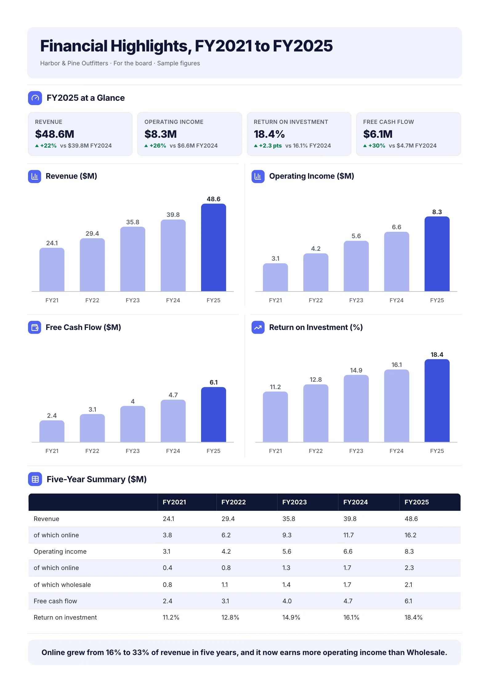 Five-Year Financial HighlightsEdit for free(opens in a new tab)
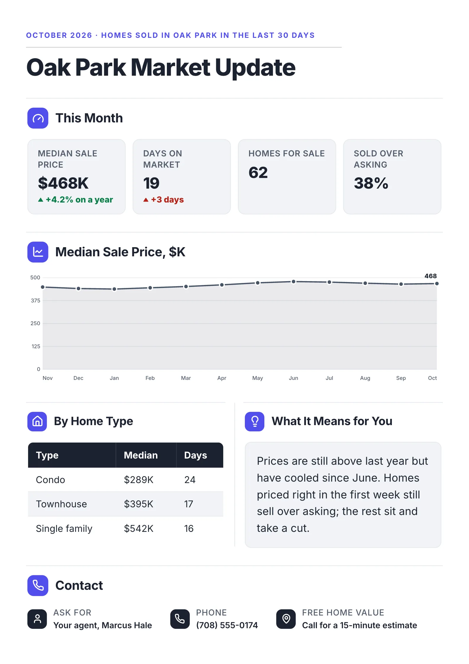 Real Estate Market UpdateEdit for free(opens in a new tab)
What we measured
For each One-Pager, the section map records every section below the title as a box. We counted the boxes, grouped them into rows, and recorded how many boxes sat in each row from top to bottom. A row of one box is full width; a row of two is a split row.
They cover reports, briefs, profiles, plans, summaries and handouts, for businesses, schools, nonprofits and government.
What the measured One-Pagers have in common
Sections: 4 to 7, and 5 most of all
| Sections below the title | One-Pagers |
|---|---|
| 4 | 18 |
| 5 | 130 |
| 6 | 51 |
| 7 | 15 |
None has fewer than 4 or more than 7. Five is the clear favorite, at 61% of the library.
Split rows: common, but rarely more than two columns
- 75% split at least one row into two side-by-side sections.
- Only 3% ever put three sections in one row.
- 53 use no split rows at all, and 47 of those are five full-width sections stacked top to bottom.
Full-width at the start and the end
- 75% open with a full-width section under the title.
- 78% end with one, most often a short contact or takeaway strip.
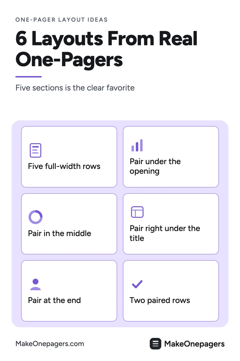
The 6 layouts that cover most of the library
The pattern is the number of sections in each row, top to bottom. "1-2-1-1" means one full-width section, then a split row of two, then two more full-width sections.
| Layout | Pattern | One-Pagers |
|---|---|---|
| The stack | 1-1-1-1-1 | 47 |
| Split second row | 1-2-1-1 | 28 |
| Split third row | 1-1-2-1 | 18 |
| Split top row | 2-1-1-1 | 16 |
| Split at the bottom | 1-1-2 or 1-1-1-2 | 18 |
| Two split rows | 2-2-1-1 or 1-1-2-2 | 14 |
Together those six cover 66% of them. The rest are variations, such as a five-row page with a split in the middle.
1. The stack
Five full-width sections, one after another. It reads like a short article: top to bottom, nothing to compare. Use it when the content is a sequence, such as a plan, a process or a story with one point per section.
2. Split second row
A full-width opening, then two sections side by side, then the rest full width. The split row puts two related things next to each other early, such as the problem and the numbers behind it.
3. Split third row
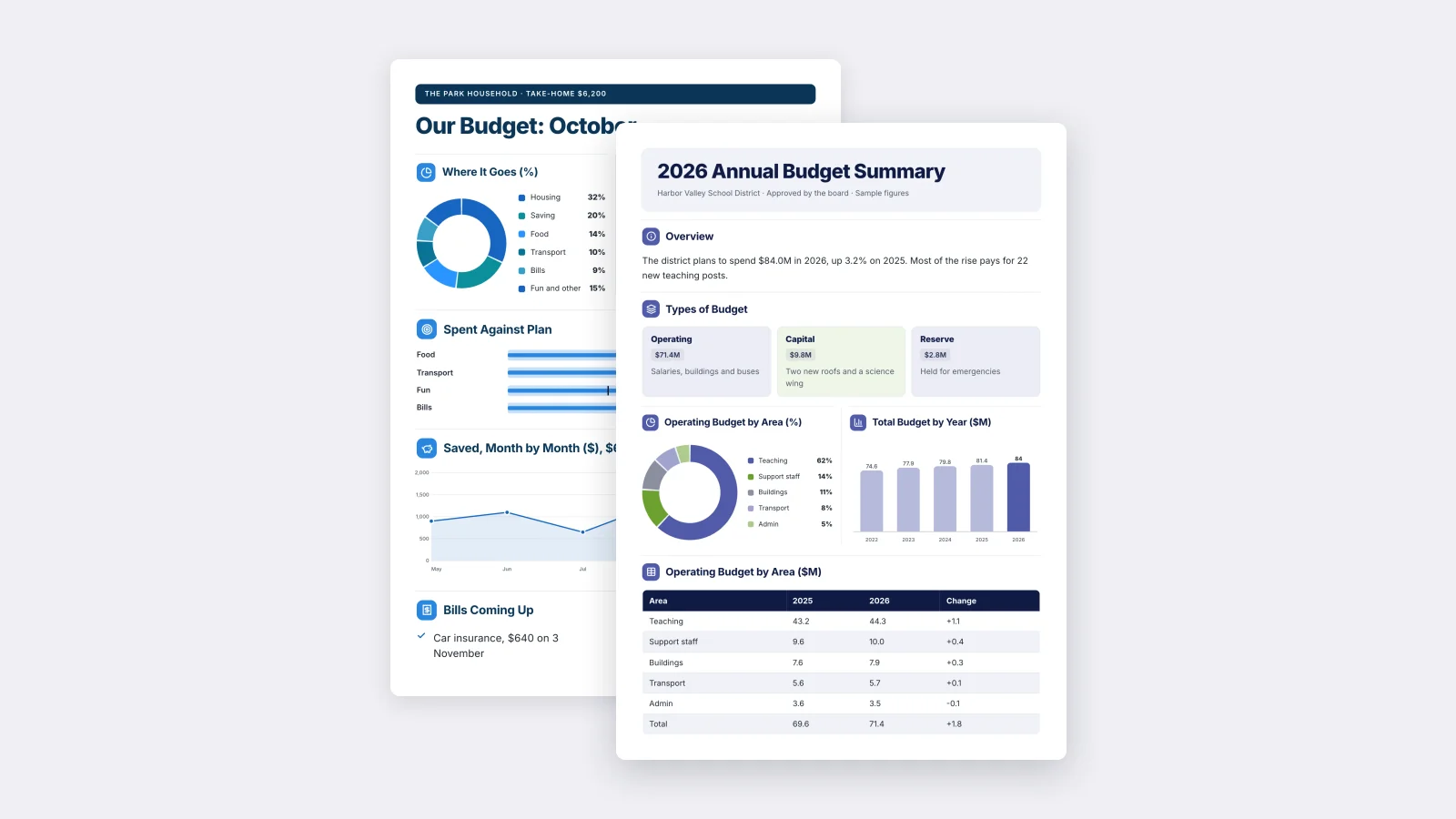
The opening and one full section set the scene, then a split row compares two things before a full-width close. It suits a summary that builds to a comparison: last year against this year, or the plan against the actual.
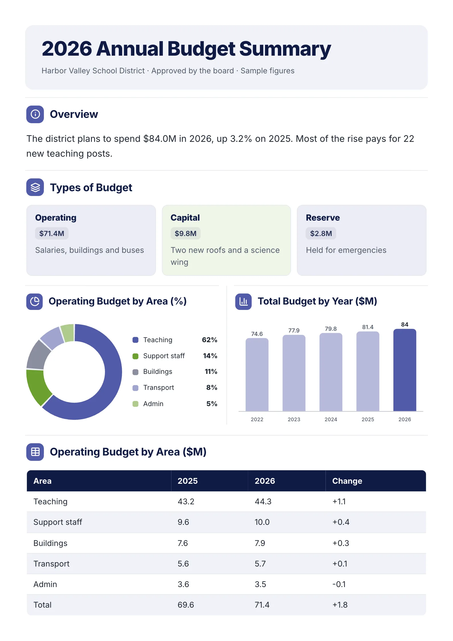 Edit this template
Split third row: the overview and three budget types first, then two charts side by side, then the table.
Open it: annual budget summary template.
4. Split top row
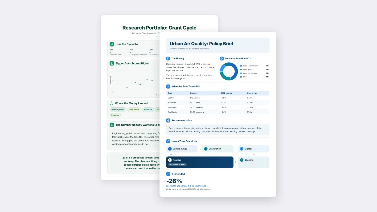
Two sections side by side directly under the title, then everything full width. It puts the finding and the evidence for it in one glance, before the reader has scrolled.
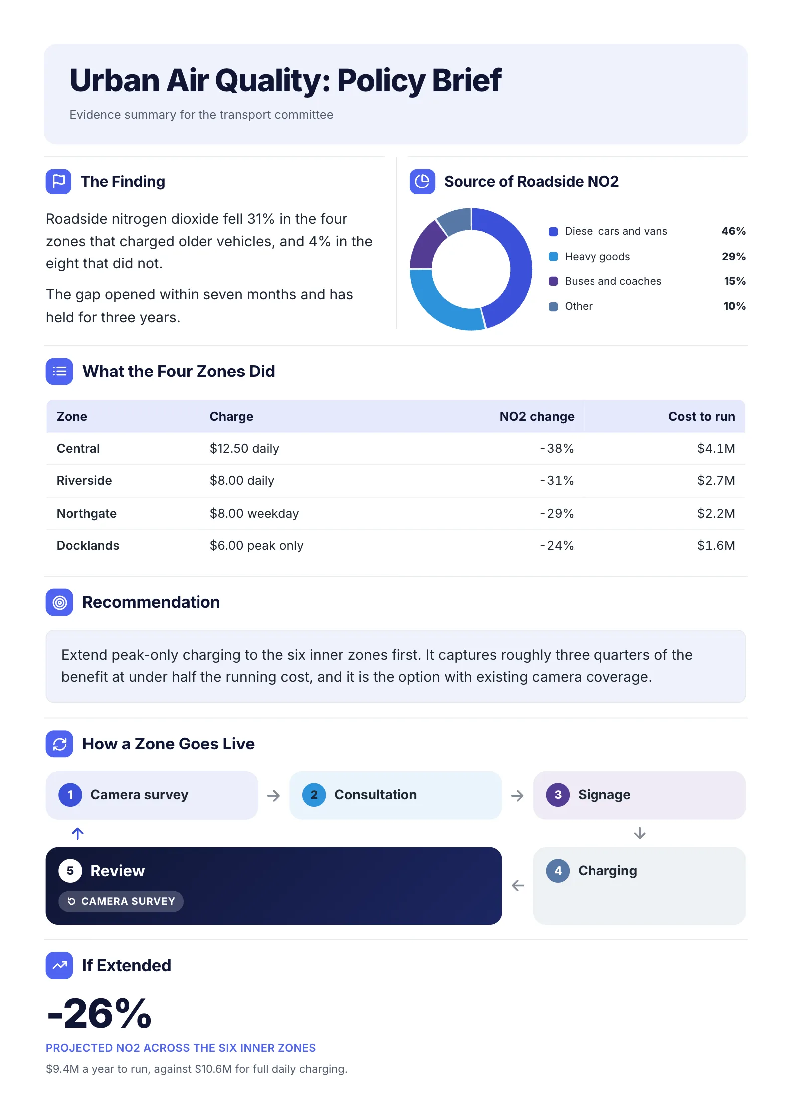
Split top row: the finding and its chart side by side, then the table, the recommendation, the process and the result.
Open it: policy brief template.
5. Split at the bottom
Full-width sections first, then a split row at the end: often two closing items such as next steps and contacts, or risks and asks.
6. Two split rows
Two rows of paired sections. It packs the most onto one sheet and works for dashboards and reports with several numbers to compare, but it is the busiest of the six. Use it only when every pair really belongs together.
How to pick a layout
| If your reader needs | Use |
|---|---|
| A sequence: steps, a plan, a story | The stack |
| The point and its evidence at once | Split top row |
| Context first, then a comparison | Split third row |
| Two related facts early | Split second row |
| Two closing actions | Split at the bottom |
| Many numbers to compare | Two split rows |
Rules most of them follow
- Four to seven sections. Five if you are unsure.
- Two columns, not three. Three-column rows appear on only 3%.
- Split at most two rows. 98% do; only 2% split three.
- Open full width. A full-width first section tells the reader what the One-Pager is about before asking them to compare.
- End with a strip. A short contact, takeaway or next-step line closes 78% of them.
- Pair only what belongs together. A split row says "compare these." If the two sections are not related, stack them.
Layout mistakes
| Mistake | Fix |
|---|---|
| Nine small sections | Merge to 5, or cut |
| Three columns of text | Two columns, or a stacked list |
| A split row of unrelated sections | Stack them |
| The key number buried in the middle | Put it in the first row |
| No closing line | A strip with the ask, the takeaway or the contact |
| Every row split | Keep at least the first and last full width |
Try a layout
Pick the layout from the table above that matches what your reader needs first, then open a template that uses it: the policy brief for a split top row, or the annual budget summary for a split third row. Or drop your notes into the free AI One-Pager generator to get a first layout, then check every line.
Frequently asked questions
How many sections should a one-pager have?
Between 4 and 7. In the One-Pagers we measured, 61% have exactly 5 sections below the title, and none has fewer than 4 or more than 7.
Should a one-pager use columns?
Usually for one or two rows, not the whole page. 75% of them split at least one row into two columns, but only 3% ever use three.
What is the most common one-pager layout?
Five full-width sections stacked top to bottom: 22% of the ones we measured. The next most common splits the second row into two.
Where should the most important information go?
In the first row under the title. 75% open with a full-width section there.
How should a one-pager end?
With a short full-width strip: the contact, the takeaway or the next step. 78% end with a full-width section.