BlogGuide
Best Fonts for One‑Pagers: 8 Fonts Measured on the Same Page
We set the same text in 8 fonts and measured how many words fit and how big each looks. The best font for a One-Pager, and when to pick each one.

By MakeOnepagers Team
Updated · 5 min read
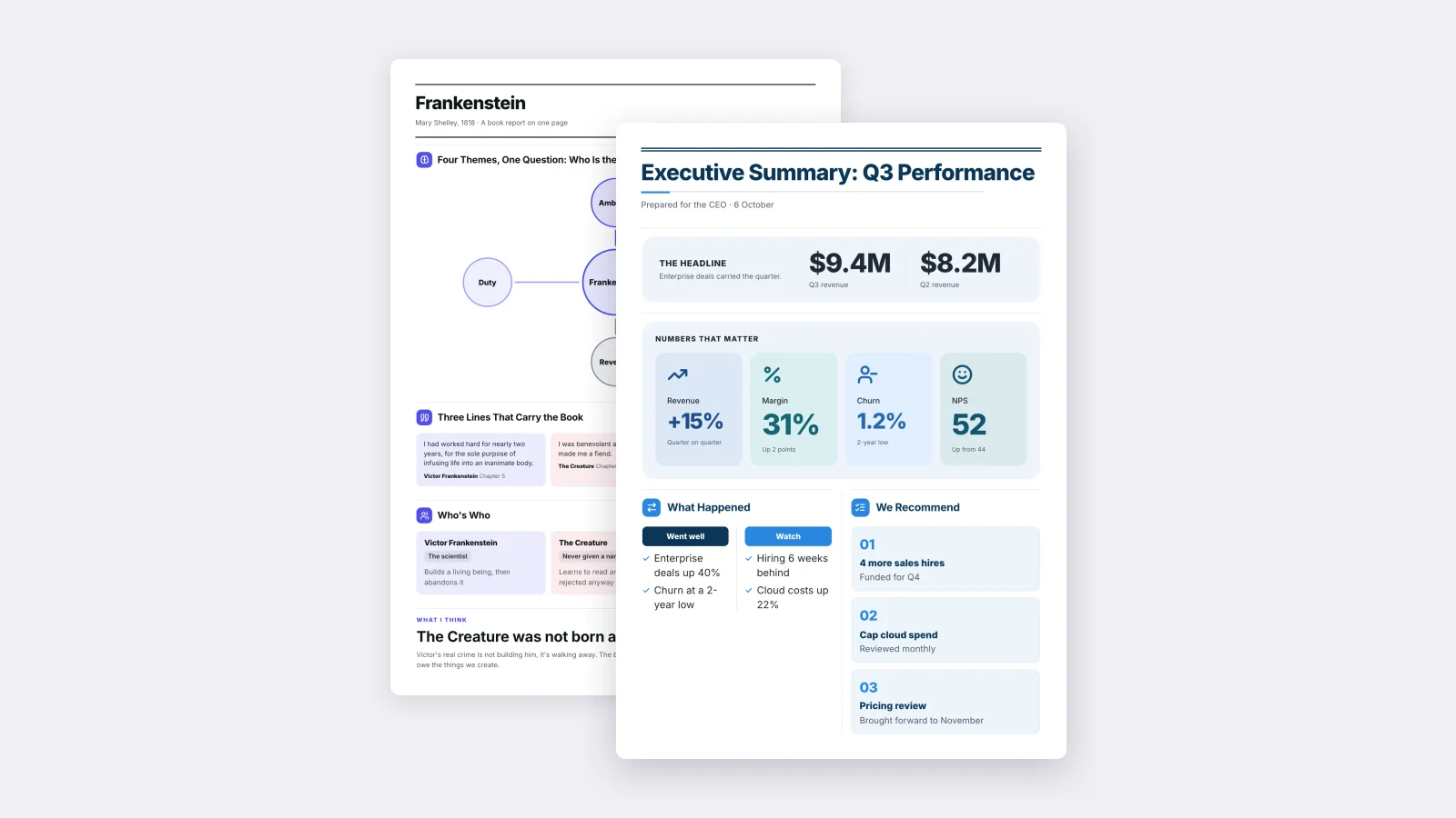
The best fonts for one-pagers are clean sans serif fonts with a tall lowercase: Inter, Arial, Helvetica and Calibri read clearly at the small sizes a One-Pager needs, on screen and on paper. Use one of them for everything, at 10 to 11 pt for body text and 18 to 32 pt for headings. Pick Georgia or Merriweather if you want a serif for a more formal or editorial look.
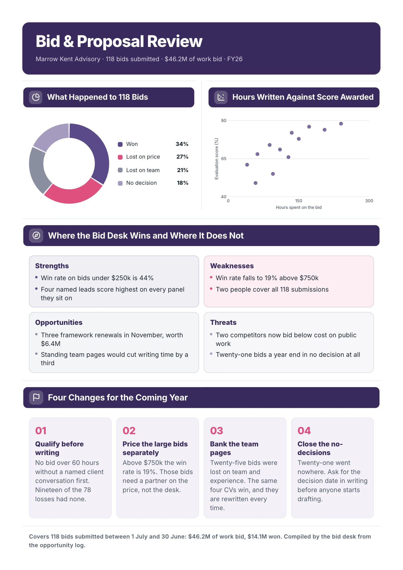
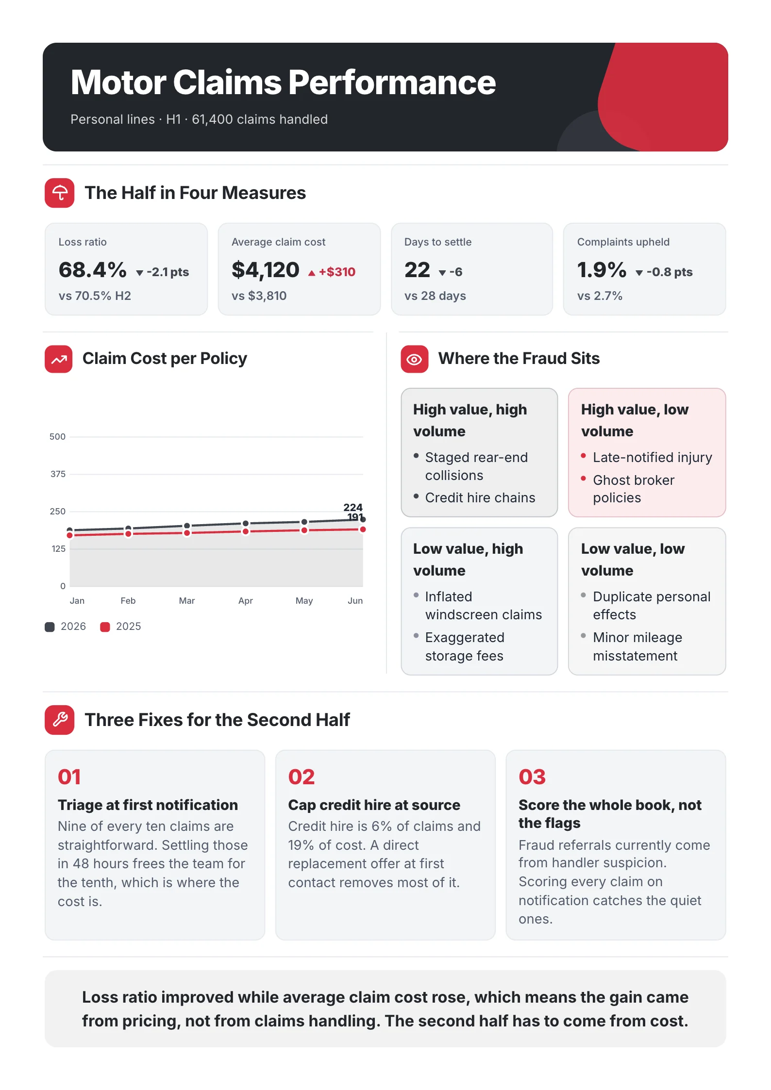
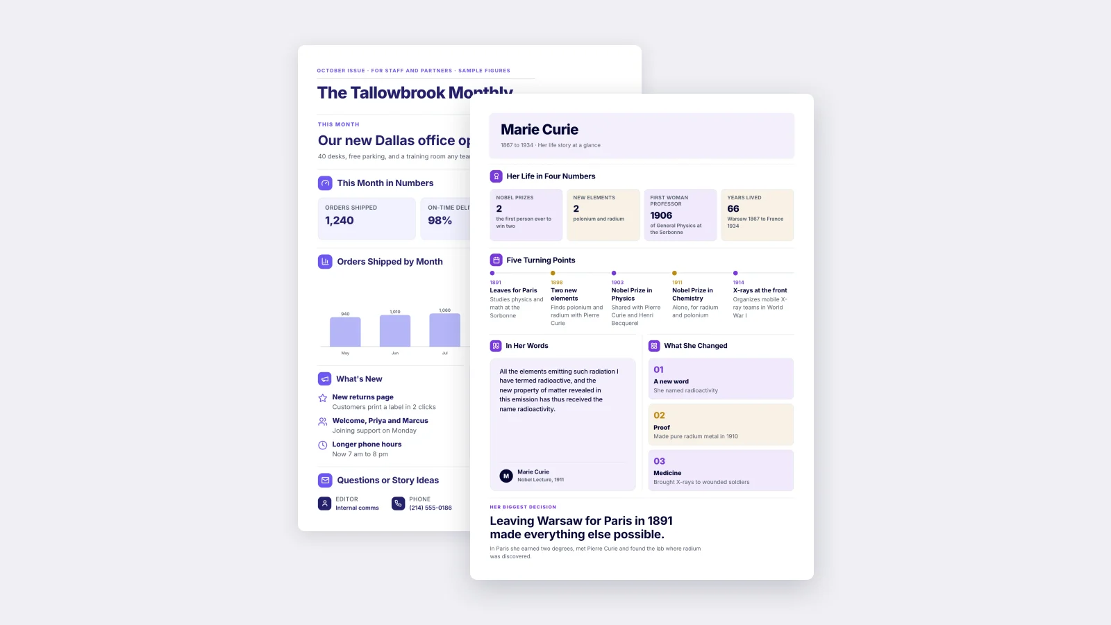
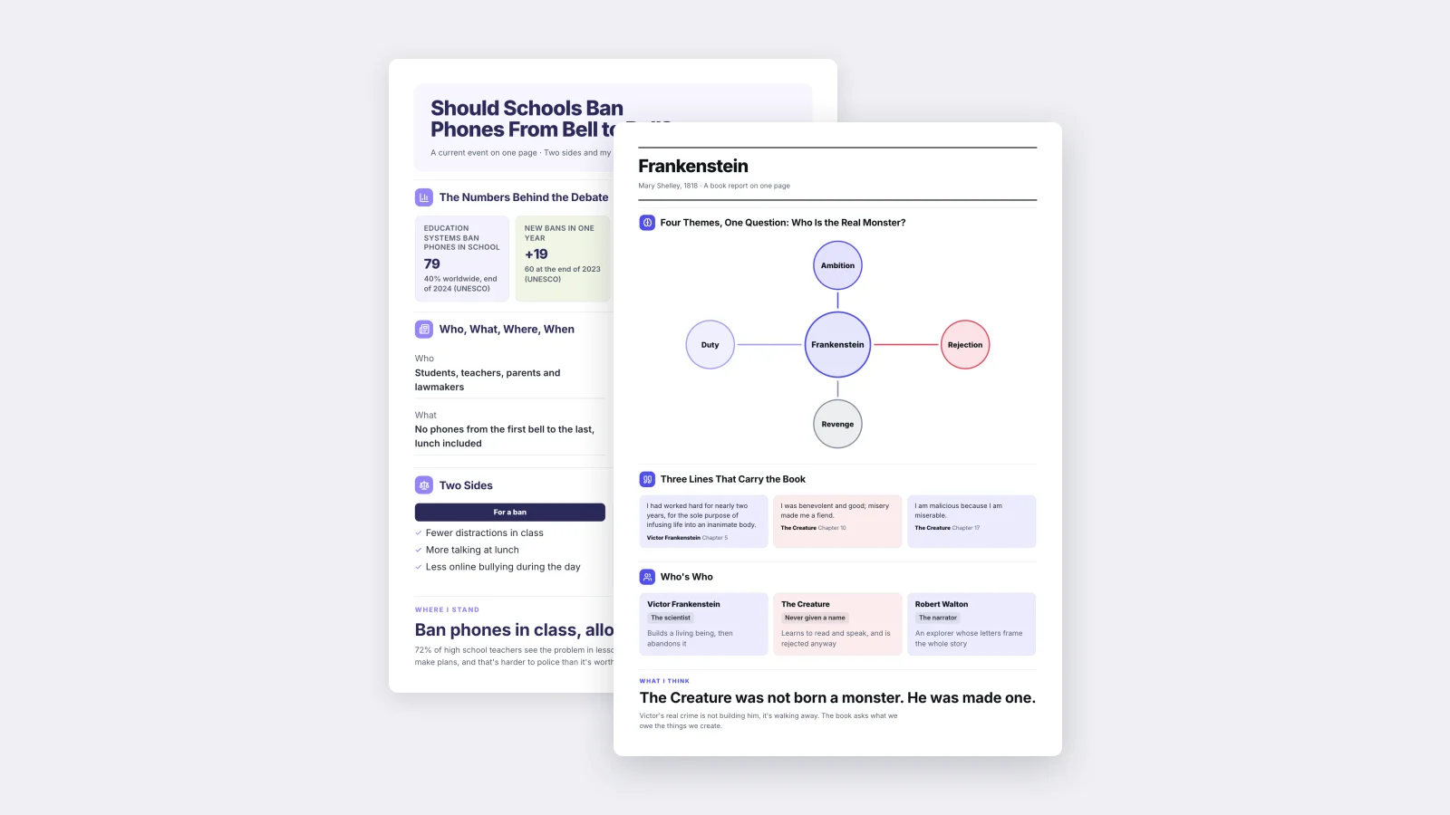
One‑Pager examples
Real One-Pagers made with MakeOnepagers. Open any one to edit it as your own.
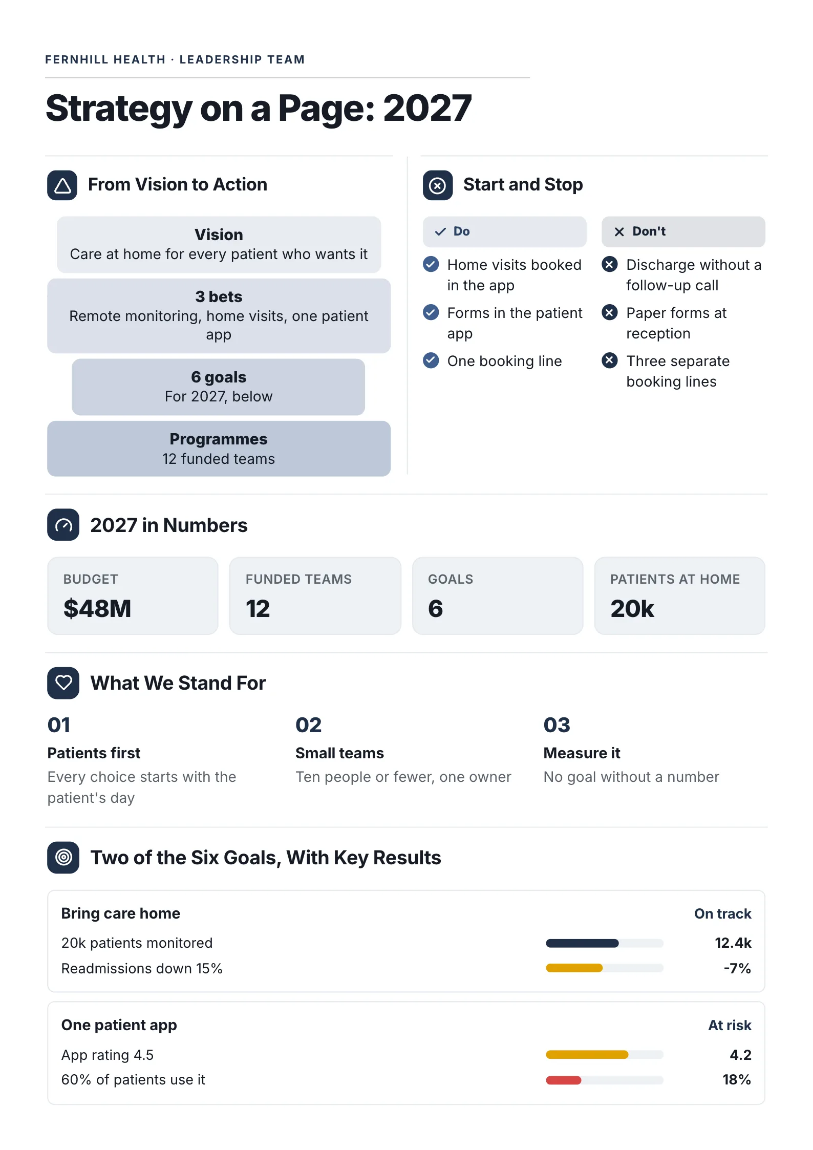
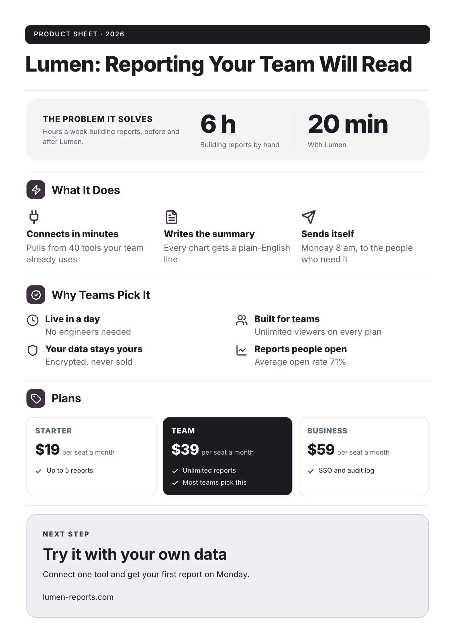
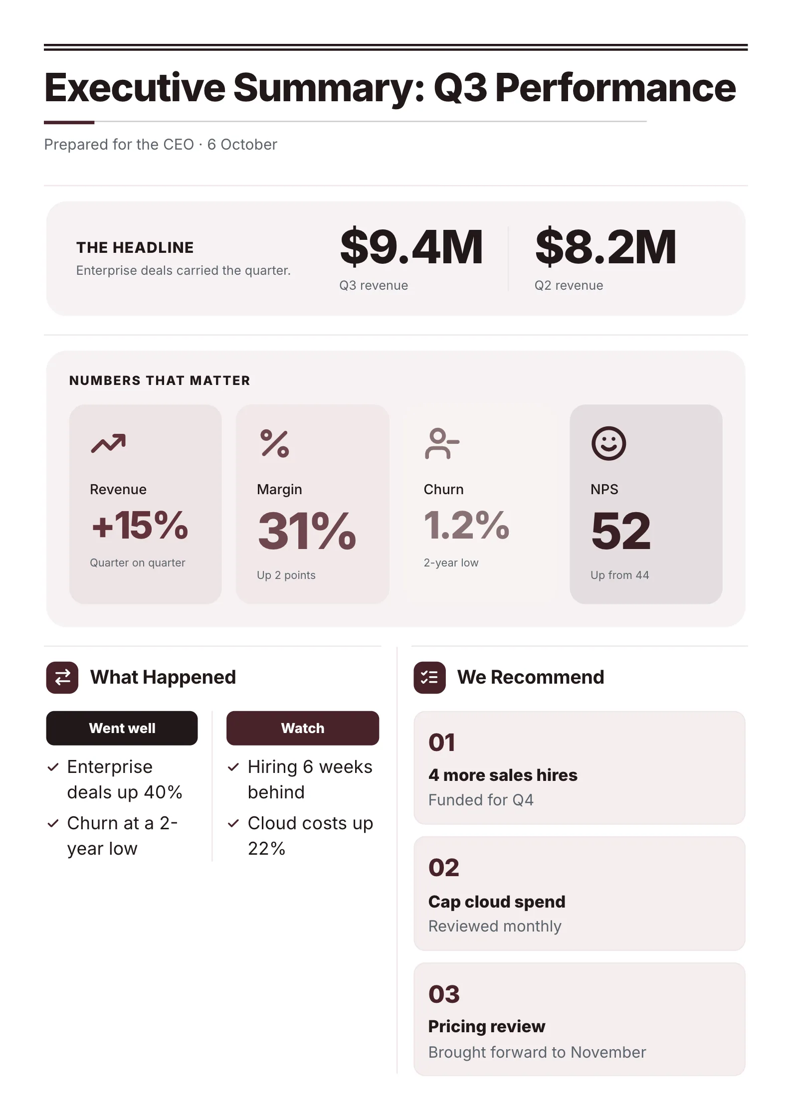
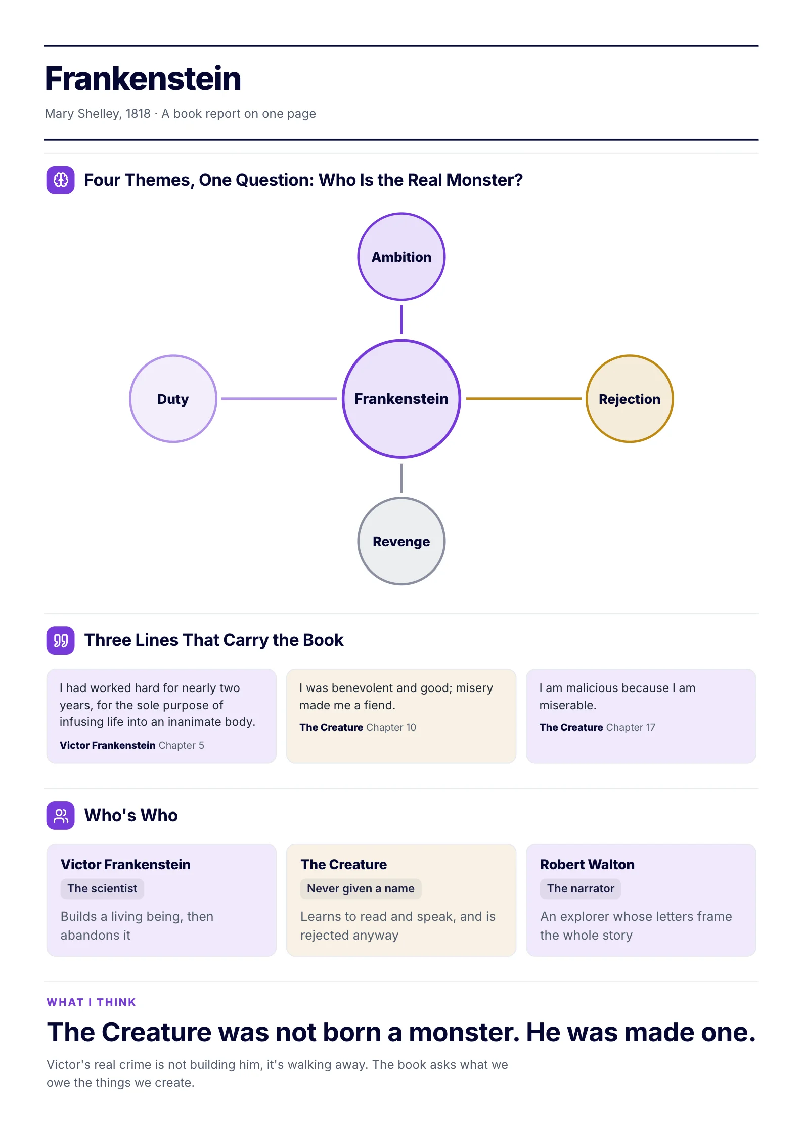
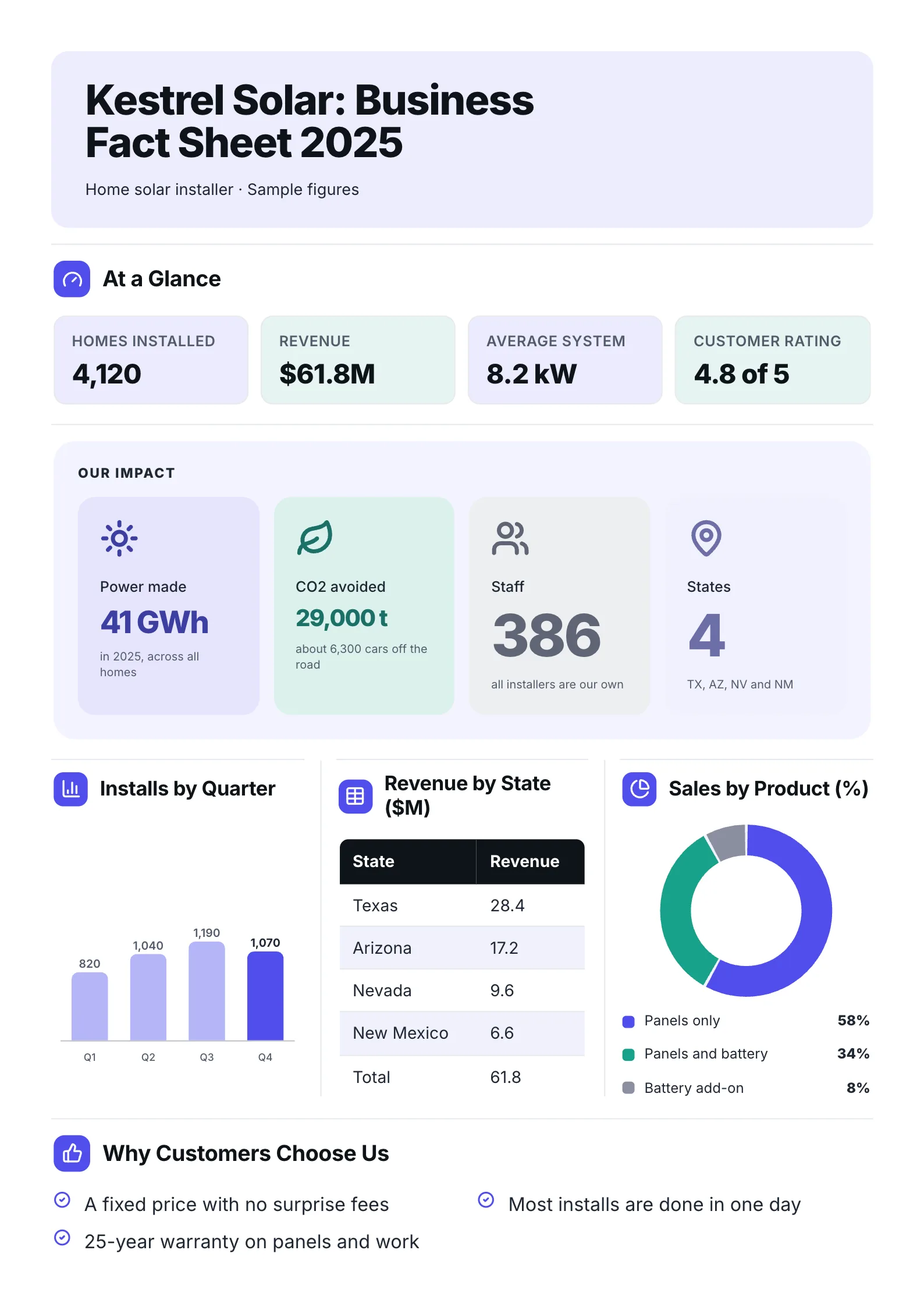
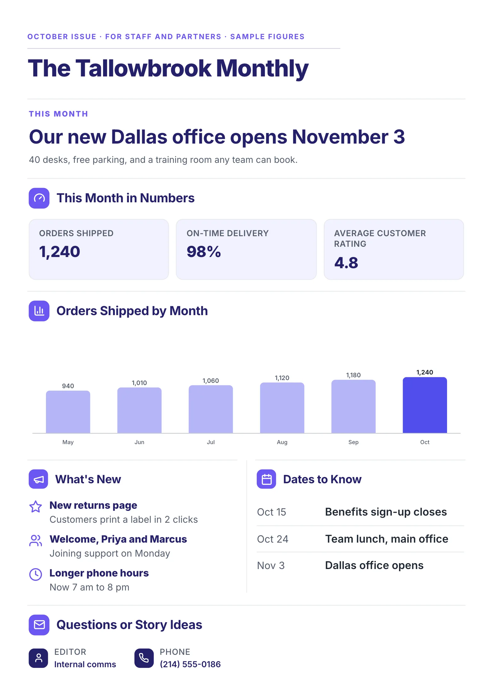
We didn't take that from a style guide. We set the same two documents in 8 fonts and measured two things that decide whether a font works on one page: how many words it fits, and how big its letters actually look at the same point size.
The 8 fonts, measured
US Letter, 1 inch margins, 11 pt, single spaced. "Looks" is the height of a lowercase x as a share of the point size: the higher it is, the bigger the font looks at the same size.
| Font | Words that fit | Looks | Best for |
|---|---|---|---|
| Times New Roman | 720-822 | 45% (smallest) | Dense print, old-style reports |
| Arial | 702-811 | 52% | Everyday One-Pagers |
| Helvetica | 702-811 | 52% | Everyday One-Pagers on Mac |
| Georgia | 702-808 | 48% | Formal, editorial |
| Calibri | 664-770 | 48% | Office documents |
| Inter | 609-686 | 55% | Screens and print, numbers |
| Merriweather | 603-683 | 56% | Serif that reads on screen |
| Verdana | 583-641 | 55% | Large, airy, low density |
The pattern is clear: the bigger a font looks, the fewer words it fits. Times New Roman packs the most words because its lowercase letters are small and narrow. Verdana fits the fewest because its letters are wide and tall. At 11 pt, Times New Roman's lowercase is about 4.9 pt tall and Verdana's about 6 pt, so Times at 11 pt looks closer to Verdana at 9 pt.
That means "use 11 pt" is not a real rule. A One-Pager in 11 pt Times New Roman looks small and crowded; the same words in 11 pt Inter look like a size up.
Why a sans serif usually wins on a One-Pager
- It holds up small. A One-Pager often puts labels, captions and chart numbers at 8 to 9 pt. Fonts with a tall lowercase, like Inter and Arial, stay readable there; Times New Roman at 8 pt gets hard to read.
- Numbers stay clear. Sans serif figures have no small strokes to blur, so a 36 pt total and an 8 pt label both read cleanly.
- It looks the same on screen and on paper. Most One-Pagers are read as a PDF on a laptop or phone first. Sans serifs keep their shape at low screen resolution.
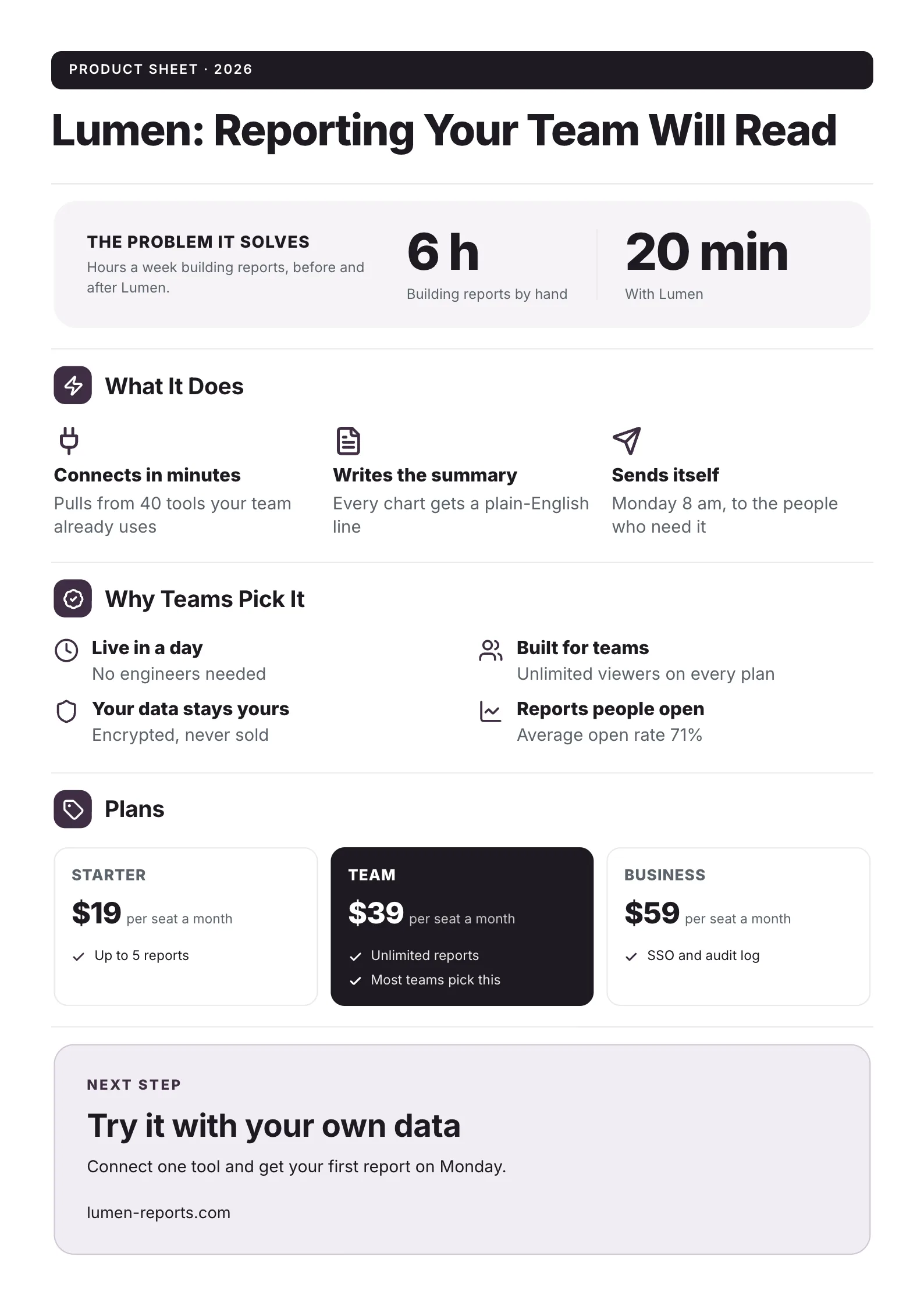 Edit this template
One font, Inter, from the small uppercase labels to the 20 min figure. The hierarchy comes from size and weight, not from extra fonts.
Sizes that work on a One-Pager
| Part | Size | Weight |
|---|---|---|
| Title | 24-32 pt | Bold |
| Section headings | 12-16 pt | Bold or semibold |
| Body text | 10-11 pt | Regular |
| Big numbers | 20-36 pt | Bold |
| Labels and captions | 8-9 pt | Regular or medium |
Our own One-Pager templates are set in Inter by default, with body text that starts at about 11.6 pt. The editor shrinks or grows all the type together so the content fits exactly one page, so the body size moves a little from one document to the next.
How many fonts to use
Use one family. If you want contrast, add a second for headings only: a serif title over sans serif body text, like Merriweather over Inter, is a common pairing. Never three. Each extra font is one more thing the reader's eye has to adjust to, and on a page this small it shows.
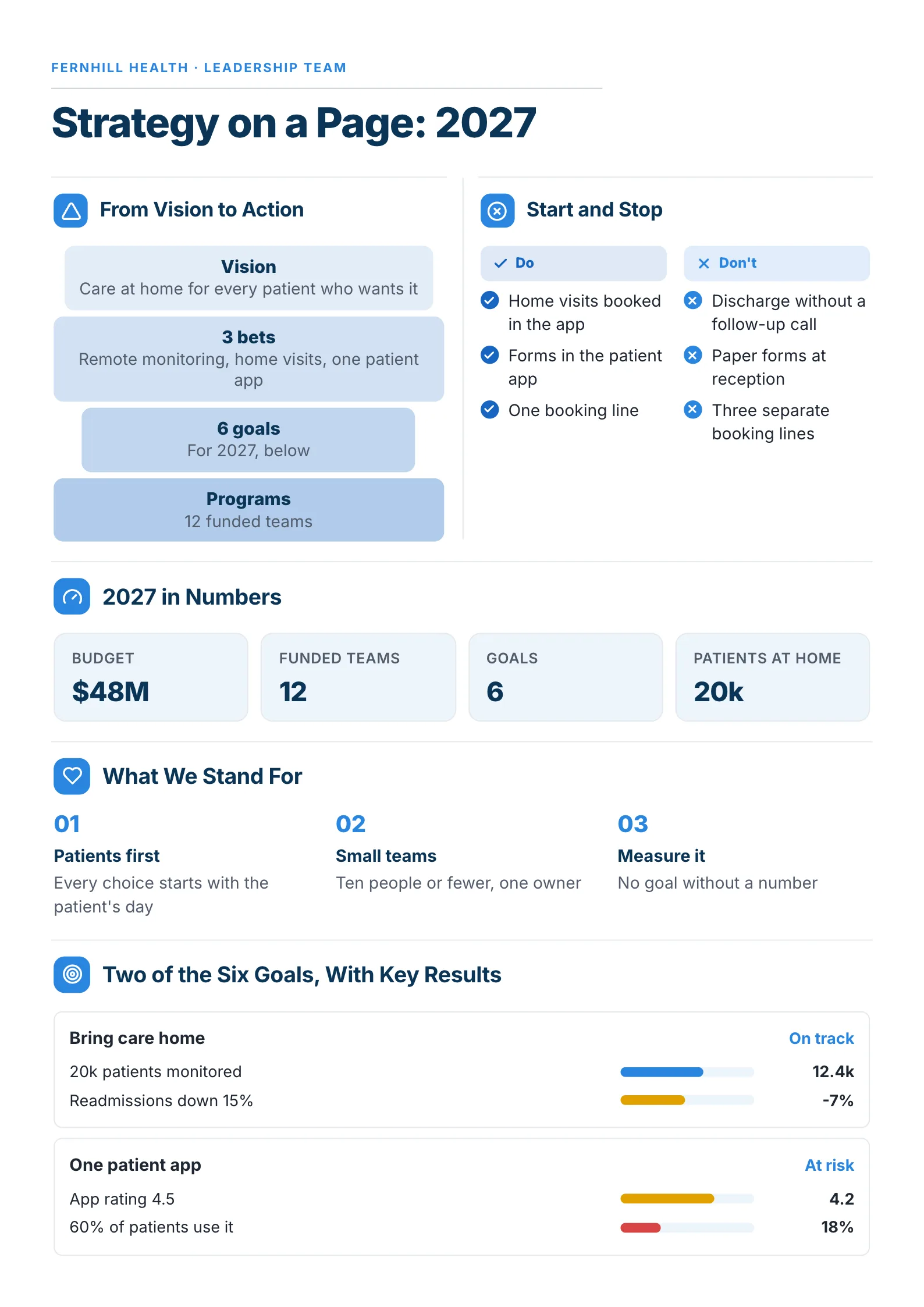 Edit this template
Uppercase labels, bold numbers and regular text: three looks from a single font.
Fonts to avoid on a One-Pager
- Script and handwriting fonts for anything but a single word: unreadable at body size.
- Condensed fonts for body text: they fit more words, but long lines of narrow letters tire the eye.
- Comic Sans and novelty fonts: readers take the document less seriously.
- Fonts your reader doesn't have, if you send an editable file. Send a PDF, or use a font everyone has, like Arial.
How we measured
We set two public-domain documents from Project Gutenberg, the Declaration of Independence and Federalist No. 10, in each font in Google Chrome, and counted the words that fit on a US Letter page with 1 inch margins. The lowercase height was measured from each font's own outline. Calibri was measured with Carlito, a free font with identical letter widths. Measured 11 October 2026. The counts for 10 and 12 pt, double spacing and A4 are in how many words fit on one page.
Get the type right without thinking about it
Every MakeOnepagers template comes with its fonts and sizes already set, and the editor fits your words to one page by adjusting the type for you. Or drop your notes into the free AI One-Pager generator and get a finished One-Pager back. Your first One-Pager is free with the AI One-Pager Generator, no account needed.
Frequently asked questions
What is the best font for a one-pager?
A clean sans serif with a tall lowercase, such as Inter, Arial, Helvetica or Calibri. They read clearly at small sizes on screen and on paper.
What font size should a one-pager be?
10 to 11 pt for body text, 12 to 16 pt for section headings and 24 to 32 pt for the title. Adjust by eye: some fonts look a full size bigger than others at the same point size.
Is serif or sans serif better for a one-pager?
Sans serif is the safer default because it stays readable at small sizes and on screens. A serif like Georgia or Merriweather works for a formal or editorial One-Pager, best used for headings.
Which font fits the most words on one page?
Of the 8 we measured, Times New Roman fit the most, 720 to 822 words at 11 pt on US Letter. Verdana fit the fewest, 583 to 641.
How many fonts should a one-pager use?
One family, or two at most: one for headings and one for body text.